Reposted from a June 24, 2014 3M-DS106 Salon Blog Post. All proprietary information has been deleted from this public version.
Internal 3M Spark Post to R&D Community:
Sharing to Learn – Learning to Share
Posted by 3M-DS106 Salon Patroness Rochelle Lockridge
The @3mds106salon continued our June topic discussion on data visualization. Having a bit of fun I showed up and shared a chart I’d made for the children’s story “Goldilocks and The Three Bears”. The chart was harder to make than I expected. Receiving feedback and hearing what others would have done provided a tremendous amount of learning directly relevant to my job. Check out the original & revised version as well as an animated GIF heat map by @Justin. Play is good!
Today’s 3M-DS106 Salon was visited by 4 of us: Rochelle, Justin, Tony & Sharon
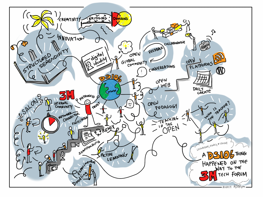
We continued our discussion on data visualization which was our topic of focus for June. (See list of links below.) As the patroness/host of the 3M-DS106 Salon I had been pondering how I could more effectively bring the digital storytelling aspect into our group. (After all, that’s what the DS stands for.  I knew from my experiences with the external DS106 that I had learned a tremendous amount of very relevant digital literacy skills by playing and having fun with the DS106 community But it’s a tough sell these days to get people to play here at 3M. We feel play is a waste of time. That we should be doing something more productive with our time.
“Anthropologist Gregory Bateson believed that the fixation on making everything productive and rational cuts us off from the world of the spontaneous that is home to real knowledge..Play isn’t a character defect; it’s the builder of character, developing persistence, competence, mastery and social skills that take us beyond perceived limitations.” [Source]
I am here to report that my supposedly non-productive activity (even I was questioning it.) of creating a data visualization for Goldilocks and The Three Bears was not a waste of time -for me or today’s Salon attendees. Sure I learned more about struggling with Excel and formatting a slide that was informative and attractive. (See my process below.) When I shared it with my colleagues I learned even more as they easily shared their suggestions on how to improve my slide by limiting the amount of text, making things more visually simple so that at a glance a viewer can get most of the information and changing from a solid fill to an image fill on my bars. However, it wasn’t until the rest of the group started to share how they would visualize the data and story that a deeper layer of learning emerged. I got it that DS106 and the 3M-DS106 version we’ve been building isn’t just about creating digital artifacts and sharing them with others, it is also about the learning that occurs when others share with us.
When I heard how Sharon might adjust the bar chart, how Tony would display the data as a color coded cross table, and Justin’s idea for a heat map and an animated GIF, Well I was blown away. Wow. This is where the power is. I was “playing” to learn more about a subject I was interested in – In this case data visualization and effective Power Point slides. I bravely shared what I had made with the group. Because of the relationships we have been building there was a comfort to continue sharing thoughts and suggestions with one another. I learned how they would do things differently than me, and knew that I would use that knowledge the next time I had a 3M project that required data visualization. I also walked away today with a deeper understanding of why I created the 3M-DS106 Salon; why I continue to do the assignment preparation work; why I hold meetings every Tuesday; and why I attempt to write a summary post following our gatherings. I am promoting a safe place for others to learn to share and their sharing is helping us learn more together. It’s all good for 3M.
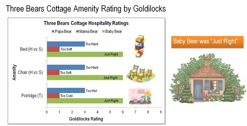
Amenity/Hospitality Ratings for The Three Bears Cottage
What I assumed to be a slam dunk creating a chart in no time at all, turned out, when I actually set down to make it, to be quite a bit more difficult than I had imagined. I had several variables and labels:
- The three bears- Poppa Bear, Mama Bear, Baby Bear;
- Porridge- Initially too hot for all three bears then: Too hot, too cold, just right;
- The chairs and beds:- too hard, too soft, just right.
I tried creating bubble charts, x-y scatter plots, different styles of bar charts. I finally settled on a basic horizontal bar chart. Defining which data would represent the series and which simply data was tricky. I kept ending up with the data points on top of one another. It was frustrating that I couldn’t get it. I don’t know if I was just tired or what. Once I had the basic chart I wanted to make the slide readable and appealing. I added an informative title, I increased the font size on the axis labels to 18pt. I found some graphics on the web to illustrate the amenities being rated. With the addition of a text box on the side, “Baby Bear was Just Right”, I wanted to communicate the final result of the “data analysis”. My final touch was the addition of evaluation comments for each bar, such as Too Hard, Too Soft, Just Right.. I agree with the group that adding the individual evaluation comments was too much for this slide.
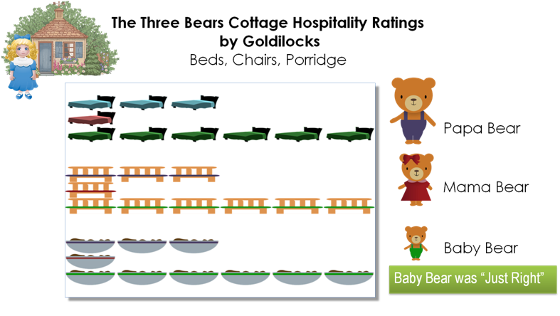
Tony suggested uncluttering with the replacement of the solid fill on the bars to images- for example 6 beds for Baby Bear’s ratings and 1 bed for Mama Bears.
Select data point bar => right click => Format Data Options => Fill => Picture or Texture Fill =>Insert picture from computer file => Choose file from computer => Stack and scale with 1 unit per picture.
This would allow for removal of redundant text. I’ve revised the slide with their comments in mind and created a new version below with more graphics and less text. Also using color coding more effectively by matching the clothes of the bears to the amenities.
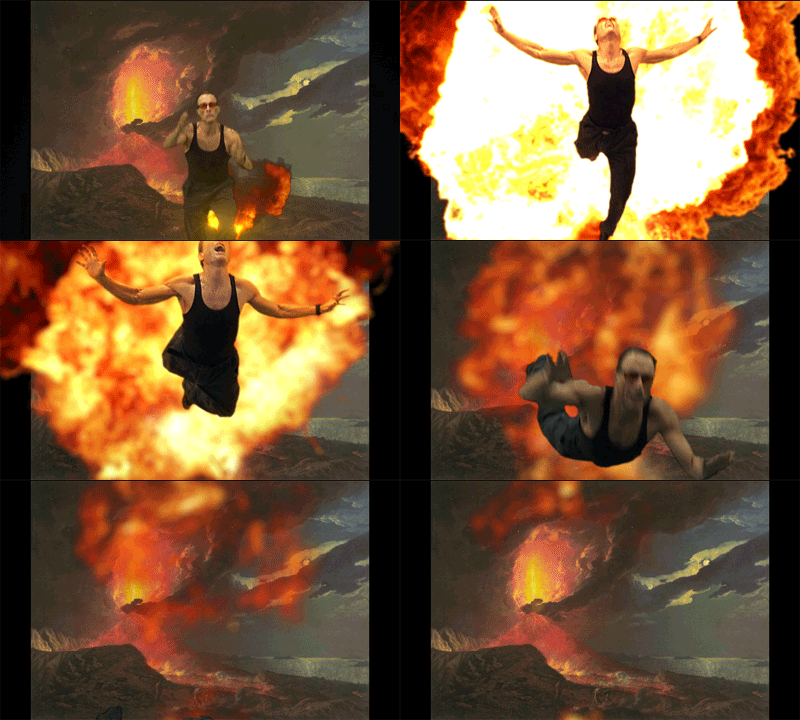
Then Justin showed us quickly how he would make a GIF that could illustrate more of the unfolding story as well. Take a look at it below. And he’s posted the how and why of making the GIF on his blog too. How might you create an effective data visualization for Goldilocks and The Three Bears. If you actually make something, you might learn a bit yourself. If you do, I’d really appreciate it if you’d share it with us so we can learn from you too.
VERSION 1:
REVISED
Less text, more graphics, color coding, removal of axis. I’m still not sure if this works yet or not. Is it clear that I am using a 1-6 rating system, with 6 being the best?
Justin’s Animated Heatmap Example:
Comments:
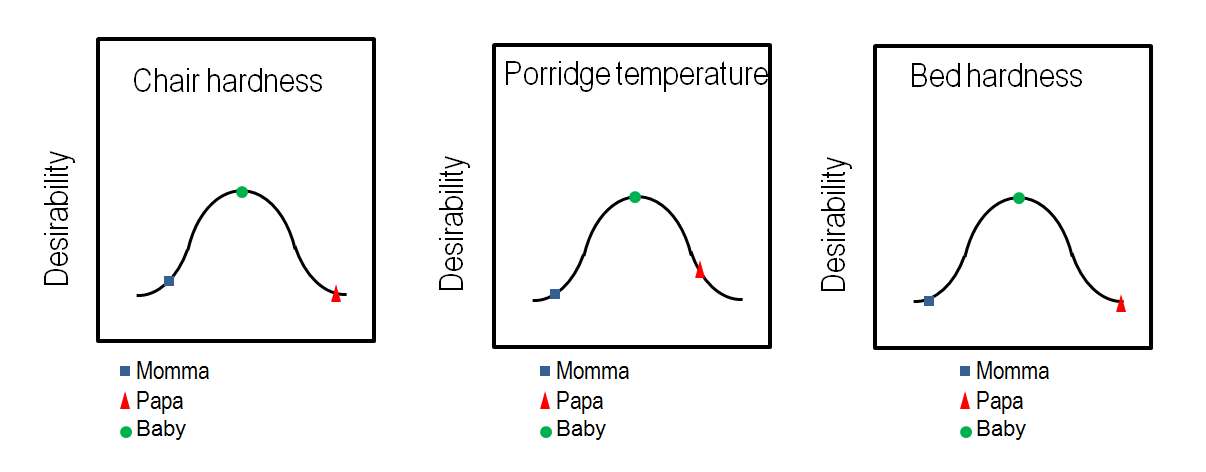
I had another commitment and was not able to attend. I hope the following is useful. Looking at either of the two slides above, I found myself struggling with confusion interpreting the length of the bar chart, or the number of objects (representing hardness or temperature). I started out with the idea that the charts showed the hardness or temperature of the objects, rather than the goodness of fit.
To me, it would have been much easier to interpret a chart that put the ‘value to the customer’, or ‘match to Goldilock’s preference’ as a dependent variable on the Y axis and the independent variables (hardness, temperature) on the X axis, and you could even estmate a bell-shaped value curve to show the ‘sweet spot’ where she preferred to be. If I get time later today, I may try to give an example, but perhaps the text is sufficient.
Hoping this input is as welcome as you usually are to my thoughts. . .
BD
Here are the charts referred to in my comment on Rocky’s earlier post re Goldilocks.
JUNE DATA VISUALIZATION TOPICS AND LINKS
- Periodic Table of Data Visualization : Excellent resource to see what’s out there.
- Link to Wikipedia overview
- Tableau Software Whitepapers on subject of data visualization
- Designing (& history of) Great Visualizations
- Data Storytelling using visualization
- Visual Analysis Best Practices
- Which chart or graph is right for you?
- http://www.tableausoftware.com/public//
- http://bost.ocks.org/mike/nations/
- http://d3js.org/
- http://bl.ocks.org/mbostock/4062045
- http://christophermanning.org/projects/building-cubic-hamiltonian-graphs-from-lcf-notation/
- http://bost.ocks.org/mike/hive/
- http://www.imf.org/external/datamapper/index.php
- Infographics
- Evolution of Infographics
- Wikipedia Link


