Tag Archives: #talkingheadless106

DS106 Audio Week 4 Reviews Are In

Play AUDIO ONLY Version DS106 Headless13 Audio Week 4 Review

Link to VIDEO version DS106 Headless13 Audio Week 4 Review

Christina Hendricks and I volunteered to be helpers for the Headless 13 DS106 week 4 Intro to Audio – Listening. As a part of that Christina organized a Google Hangout: ds106 Radio How To Jamathon on broadcasting to DS106 Radio. Then on Saturday we pulled together and reviewed the radio bumpers and sound effect stories created by the “headless” ds106ers this week.

DS106_wk4_RnC_Smile

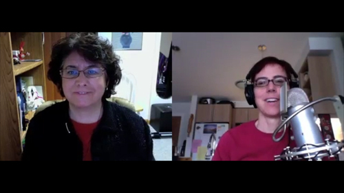
Rochelle Lockridge & Christina Hendricks review the DS106 Headless 13 week 4 audio projects.

To make it easier for the two of us we’ve divvied up the write-ups such that Christina’s post provides the discussion of the audio material for the podcast, while my post is covering the nuts & bolts of production.

1. To start with we took quite a bit of time scouring the ds106 Google+ Community, #ds106 Twitter feed, and ds106 linked blogs to find completed assignments. We kept track of links and comments in a shared Google Doc.

2. We had contemplated doing the show live on DS106 Radio, but neither of us had the experience to pull that off. Eventually we’ll get there.  But first I have to figure out how to route my system sound through Skype, so the person on the other end can hear the additional audio I’m playing at my end.  I’ve read a bunch of tutorials, corresponded with experienced ds106 radio broadcasters, and have become quite friendly with the Skype test call lady testing a multitude of settings to use with NiceCast.  Nothing has worked yet.  I’m beginning to think that my Mac hardware and operating system (10.6.8) might be the culprit.

3. We finally settled on “simply” recording our Skype conversation and turning it into a podcast to play on DS106 Radio next week.  For recording I use:

Call Recorder For Skype (Mac Only): $29  http://www.ecamm.com/mac/callrecorder/

It allows me at the click of a button the option to record each side of the conversation as audio and video on separate tracks. It also provides a number of translation tools so I can combine them as needed.

4. It took us almost an hour to get ourselves set-up to record the conversation.  We tested levels and other settings to make sure we were good there. We had all of our audio tracks lined up and ready to go as quickly as possible in real-time.  This would lessen the post-production editing time.  Dead air and click, click, click as we find something on our computer doesn’t make for a riveting podcast.

5. Our 53 minute conversation went smoothly, except for three spots we had to edit when:

  • My little dog Abby was scratching the floor so loud Christina couldn’t concentrate.
  • Christina’s husband decided to pop in to get something from the fridge.
  • I pulled up Stefanie’s DS106 Rap too early in the sequence. (This caused me to move the segment to later on in the podcast, which resulted in some jumbled conversation as noted in Christina’s comments below.  Oops!)

6. Once the recording was finished, then comes post production.  We had both thought the review would be about half as long, and I wasn’t keen on using up half of my remaining minutes on my SoundCloud account to post the 50+ minute podcast.  Christina also had restrictions on what her Tumblr blog would allow for media embedding.  My inspired idea to post it on YouTube addressed both of our issues.

7. I used the movie translation tools with the Skype recorder app to produce a side-by-side video chat. This was loaded into Adobe Premiere Elements 11 for the Mac. Unfortunately, something went wrong with the translation or maybe importing it into Premiere which resulted in the sound and video being out-of-sync after only a few minutes into the conversation.  I was able to keep our introductions, but the remainder of the video would have to be manually re-synced bit by bit, (which would be painstakingly slow and tedious). My fix? To overlay still images & GIFs in place of the messed up video.

DS106Headless13_wk4

 To make it a little more visually interesting, I added the animated DS106 Radio GIF when we are playing an audio clip.

7.  chicken_2After the first draft was completed, Christina reminded me she had envisioned us including John Johnston’s Chicken Talk podcast material as intro and outro clips.  Boy did I amuse myself. I used the Mel Blanc and Sound Effect Man- Chicken Farm Song. Then one thing led to another and John’s B&W chicken GIF and his Red cartoon chicken GIF became once again stars in one of my videos [First appearance in Star Spangled… WHAT?!] The B&W movie studio chicken brings us in, and a duet with the B&W and the Red chicken take us out. I think it’s really funny! Although after looking at it again, I wish that I had flipped sides so they were singing to each other instead of back-to-back. (See update below.)
LouNChristina_Flag_38. Christina also noticed that our sound levels were unbalanced and at times she had difficulty hearing her comments when listening on her iPod earbuds.  Unfortunately, it would have been a HUGE piece of work for me to go back in and fix it for the video. I should have used the Levelator before I began the editing. This is a free software app that helps to balance the volume of a recorded conversation. It was recommended by John Johnston in his audio post Levelling up the LoDown . (The tip is about 3:30 minutes in.) I tried using it after the fact and it brought her volume up, but also the background hiss. It didn’t make it easier to hear her, so I left it as is.

9. The finishing touches required me to add two additional DS106 Radio bumpers at the beginning and end.  The first one is a mashup I created this summer.

The final bumper at the end of the podcast was produced by Ary Aranguiz.

10. But wait… there was more that wasn’t quite right…. an excerpt from an e-mail received while I was writing up this post.

The only thing I noticed is that when we switch to talking about Ary’s project, after we talked first about Stefanie’s, the wording gets a bit garbled and then jumps to “Ary”, then goes right into her sound effect story (at about 27:25). I expect this is the best that could be done with the fact that we had to cut something out! Just wanted to check that how it ended up is what you meant, as it seems a bit jumbled.

Oh, and I just listened to the end, b/c I hadn’t had a chance to do that yet, and your last words are: “I had fun…I will” and then it jumps to the music. Not sure if you wanted to end it there?

But hey…this does not have to be perfect, and I don’t want you to put any more work into this if you don’t feel it’s necessary…so feel free to say: Christina, it’s just fine as is!

And in the end… that I decided to NOT INDULGE MY PERFECTIONISTIC TENDENCIES and let these go is a good sign.  I’m getting more comfortable allowing myself to be seen in the world as a work in-progress, blemishes and all.

UPDATE: I tried…. I really tried to let it go.  But when I heard the HUGE error with Ary’s radio bumper accidentally playing over a part of our conversation – I HAD to fix it.  It turned out I had moved the bumper clear up to layer 8 while adjusting something else and forgot about it. The error was towards the end, and I hadn’t taken the time to listen to the entire 51 minute audio file before I posted it. Lesson learned? Either make my projects shorter or listen to the whole thing before I decide to release it to the public. I may’ve let it be played on DS106 Radio, but when Alan Levine decided to add it to the week 4 assignment page, so that future students could hear it, there was no way that mistake was going to remain for posterity.

Since I was going to edit the file anyway, I decided to fix the rest of what I could.

  • I essentially started over by separating the two audio tracks, which allowed me to boost Christina’s volume and apply a noise reduction filter to her audio only.
  • Alan Levine & John Johnston had recommended that I dial down the audio quality from 256k to 128k to reduce the file size.  John said he’ll even go as low as 94k.  My comfort level with the lower sound quality isn’t great, but I’m willing to listen to the voices of experience here.
  • Alan also suggested that I add meta data to the mp3 version so that when it plays on DS106 radio people will know what it is.
  • Remember my concerns about the length of the 51 minute audio file and where to post it? Once again Alan & John came to the rescue offering me advice on uploading the file via FTP to my own website and embedding that file into my blog post. I use Cyberduck for the upload and followed the directions for the Compact WordPress Audio/Music Player settings to get the cute little player button at the top of this post
  • What the heck… I flipped the chicken images too.  They are now singing their duet to one another.

Attributions & Links:

Ary Aranguiz- DS106 Radio Bumper 2 (The one accidentally inserted into the original version of this podcast.) https://soundcloud.com/ary-aranguiz/ds106-radio-bumper2

Rochelle’s sound effect story: [Headphones highly recommended] Spend a summer day at an island cabin in Northern Wisconsin. Wake up to the sounds of loons on the lake. Spend the day enjoying all the amenities that no running water or electricity can provide. Fall to sleep to the rumbling of a thunderstorm. And don’t get me started on the MOSQUITOES!

Me In Week 3 – Telling Stories

Weekly Summary Checklist

Here’s a run-down of what I accomplished in DS106 Headless 13 Week 3 – Digital Storytelling.

First Things First:

Rockylou_HeadlessWhat is a story? What is storytelling? What is digital storytelling? Wanting to understand and become a better digital storyteller is what attracted me to DS106 in the first place, so I’ve been doing some serious pondering all week.

In my professional life as a strategic business/technology analyst at 3M I am often presented with a great deal of data and information that needs to be communicated to a variety of audiences with different levels of interest and familiarity with the subject matter.  Sharing the raw data, as it were, would almost certainly be a waste of time for everyone.  It’s my job to “COMMUNICATE” that information, not just gather it and spit it back out again.

I am paid to be a curator of information AND a storyteller. It is the story I create and tell that is based upon that data and information that is the key. Even the media I use to tell the story has an impact on the effectiveness of communicating the information. With a global asynchronous audience I can’t rely on personally sharing the story in real-time with a live person in attendance who is engaged in the moment, that can ask questions, get clarification, etc. Mastering the art of DIGITAL storytelling is a must for me. Read my complete blog entry Whatsa’ Story! for more. And here’s a cute tappable digital story from Nathalie using the Tapestry app I learned about in our DS106 Google+ Community. (If you see a great big blank space below, refresh your screen and try again. Embedding the Tapestry stories is buggy.)

And from one of my 3M-DS106 Salon Members: “Storytelling Used in Poaching Talent (3M-DS106 Repost)” shares how storytelling can be used in a number of ways, from sharing experiences, showing a vision, an escape from the real world or even poach top talent from another company.

Kurt Vonnegut’s Shape of Stories:

StoryShape_WormsCrawlIn_EditI chose a favorite childhood song that my mother taught us to sing as part of her master plan to keep us kids from fighting, “The Worms Crawl In, The Worms Crawl Out”.

“Did you ever think when a hearse went by, that you might be the next to die. They wrap you up in a big white sheet. They bury you down about six feet deep.  The worms crawl in, the worms crawl out. The ants play pinochle on your snout. Your liver turns to a slimy green. And puss comes out like whipping cream. Your eyes pop out your teeth decay. And this is the end of a perfect day.”


Vonnegut’s video was entertaining as well as informative, and I could easily understand how to apply his theory of common graph-able shapes to stories. But mine didn’t quite fit until I had looked at the infographic created by Maya Eilam and discovered the “From Bad to Worse” story shape.

Here’s the video I made for a past daily create TDC577 singing through this sorrowful story shape.

Daily Creates:

tdc611 An Interesting high contrast B&W image of an easily overlooked object:

Lamp

tdc613 Photo representing TDC idea of regular exercises of creativity.  The write-up for this photo included a blog post on the The Chemistry of Creativity: Riding The Dopamine Wave

Riding the DS106 Dopamine Wave

tdc614 an Alien Inspirational Greeting Card

Alien Inspirational Greeting Card

I love the surprises and inspirations I find by following other DS106 blogs and accounts. For the alien greeting card daily create, Bill Smith’s image inspired me to rif-a-GIF.

DS106 Hijacking. View Oiginal Image Here

Shared from rockylou22 using Embeddlr


tdc615 Idea of Clarity

Clarity

As a bonus daily create from week two, tdc607 –  the movie trailer for my website, was finally completed with A Trailer for Two.

Telling a Story in Photos:

Creating my Five Card Flickr Story ,”Five Card Poetry – My Story” wasn’t as easy as I thought it was going to be. I was way too literal at first. I started by reading the directions and figured this was going to be a piece of cake- just pick out 5 photos and tell a story ‘about’ them. (ALERT: “about”) I tried a few hands, picked some images that seemed to follow a theme, but none of them told a story…..

Oh… that was different than what I was thinking. They were continuing to flesh out their stories in a poetic rather than a prose format. The photos were telling the story, not me telling a story ABOUT the photos.  Back to the drawing board. This time I got out of my literal mind and engaged my heart and soul to sense what was here. Then the story revealed itself.

I crave community. Do I need to be flashy and bright to be seen? Do I need my words set in stone to be valid? Is it okay to have fun and learn along the way? With heart, body, and soul my story can be shared.

Participating in DS106- It’s not just ME!

Participating in DS106 continues to be a rich learning experience.  As I am facilitating a concurrent version, the 3M-DS106 Salon at my professional workplace, it permeates all areas of my life.  I have found my direct interactions through blogging, commenting, reading, and sharing with other DS106 participants to be more valuable than the lectures or texts shared with us.  This was unexpected. I had wanted to learn about digital storytelling and thought I just needed to get access to the “professionals” out there who could define it for me.  I was mistaken.  Don’t get me wrong. The videos, graphics, texts, etc are helpful, but I learned the most simply reading other DS106ers explain and illustrate their definitions for what a digital story is. Here’s a list of those I could link back to.

3M-DS106 Salon

And sometimes I am totally surprised and delighted with what I find when I pop in to leave a silly comment like when I witnessed a touching father-son interaction in Bill Smith’s post,  Art Making

Website Always Under Construction

ConstructionSign_1

I’m always working to improve the experience of visiting my blog – for my guests and me personally.  This week I…


  • Added the Flag Counter and Revolver Maps widgets after seeing it on Ary Aranguiz’s blog, All The World Is A MOOC.
  • Continue to debug my comments interface.  I’ve really appreciated people letting me know they are having problems when trying to leave a comment.  I need to know about stuff like that so I can fix it.  Thanks!

Sorrowful Story Shape

Link to Worms Crawl In Video

DS106 Headless 13 Week 3 was all about the basics of digital storytelling. Part of our assignment was to watch a video of Kurt Vonnegut humorously illustrating his rejected master’s thesis in anthropology that showed how the journey of a story’s main character can be graphed to reveal the story’s shape.

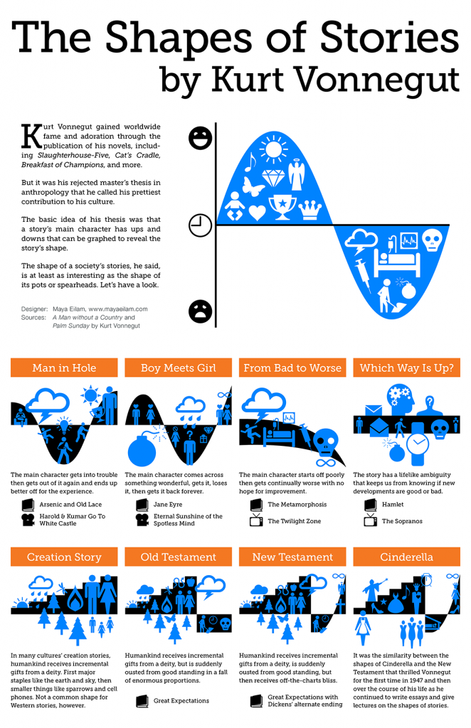
Maya Eilam created an infographic that illustrates these story shapes beautifully with examples we can relate to like: The Twilight ZoneJane Eyre, and Harold and Kumar Go To White Castle.

I was glad to see that she had a few more story shapes than what Vonnegut had shown in the short video segment since the story I wanted to use didn’t seem to fit.

After watching this video, write a new blog post and explain a story that you’re familiar with in terms of Vonnegut’s approach. Pick a movie, TV show, book, poem song, etc. The idea is to outline the shape of that story in a visual and descriptive form. Use some kind of media to do this, make it drawing or video or whatever you like. Be creative!

StoryShape_BoyInHoleAt first I was going to simply say that my story was a modified “Man In Hole”.

But lo-and-behold, my childhood song “The Worms Crawl In” will nicely fit into the “From Bad To Worse” story shape – starting off poorly then getting continually worse with no hope for improvement.  For an August DS106 daily create tdc577, my movie trailer for a favorite childhood song or nursery rhyme (embedded at the top of the post)  has me singing this song.

As you can clearly hear the poor soul my siblings and I would raise our voices to in song, under the guidance of our mother, was in bad shape and was only getting worse.

“Did you ever think when a hearse went by, that you might be the next to die. They wrap you up in a big white sheet. They bury you down about six feet deep.  The worms crawl in, the worms crawl out. The ants play pinochle on your snout. Your liver turns to a slimy green. And puss comes out like whipping cream. Your eyes pop out your teeth decay. And this is the end of a perfect day.”

StoryShape_WormsCrawlIn_Edit

There is one final uplifting phrase at the end “… and this is the end of a perfect day.”  But I think that was just an add-on by some well-meaning parent who needed to make the story shape into the more familiar things-all-work-out-in-the-end “Man In Hole”. WarmsCrawlIn

Come to think of it, there were quite a few stories and songs with the “From Bad To Worse” shape in my youth.  Hmmmmmm…. I wonder what Vonnegut’s anthropological lens would have to say about the culture I grew up in? 🙂

Five Card Poetry – My Story


Five Card Story: Sharing my story

a Five Card Flickr story created by Rockylou22

I crave community. Do I need to be flashy and bright to be seen? Do I need my words set in stone to be valid? Is it okay to have fun and learn along the way? With heart, body, and soul my story can be shared.

I crave community….


flickr photo by directrix291

Do I need to be flashy and bright to be seen? 


flickr photo by bionicteaching

Do I need my words set in stone to be valid?


flickr photo by Serenae

Is it okay to have fun and learn along the way?


flickr photo by bionicteaching

With heart, body, and soul my story can be shared.


flickr photo by bionicteaching


Creating this Five Card Flickr Story wasn’t as easy as I thought it was going to be. I was way too literal at first. I started by reading the directions and figured this was going to be a piece of cake- just pick out 5 photos and tell a story ‘about’ them. (ALERT: “about”) I tried a few hands, picked some images that seemed to follow a theme, but none of them told a story. I finally chose the above deck and started writing a narrative about how we are social beings, and that storytelling has always been a part of who we are as human beings, that it is our way of sharing with the present to make an impression on the future.  blah…. blah…. blah… BORING. No story was making its way into the world.

I then contemplated just pulling another hand, but decided instead to hang in there. I went back and looked at examples. Oh… that was different than what I was thinking. They were continuing to flesh out their stories in a poetic rather than a prose format. The photos were telling the story, not me telling a story ABOUT the photos.  Back to the drawing board. This time I got out of my literal mind and engaged my heart and soul to sense what was here. Then the story revealed itself.

I crave community. Do I need to be flashy and bright to be seen? Do I need my words set in stone to be valid? Is it okay to have fun and learn along the way? With heart, body and soul my story can be shared.

I’m glad I decided to hang in there with the original photos and relaxed into letting my creativity and intuition flow, instead of staying stuck in my literal mind and trying to get a set of images that I could logically put together into a story.


EnglandRainChair

My struggle to tell the story of these five cards reminds me of how it took until my early 40’s before I could “understand” what poetry was all about. I knew I was missing something & really wanted to “get it”.  So at my request a wonderful minister friend sat down with me and took the time to teach me what poetry was all about. She read different authors to me, had me read them to her, shared how you have to let your mind go, see and feel the images the author is conjuring up for you. This wasn’t a logical mind thing.  A black chair is not just a black chair. There is a whole story beyond the literal black chair that you tap into to “get” what the poet, photographer, writer, artist, digital storyteller,… is trying to say.

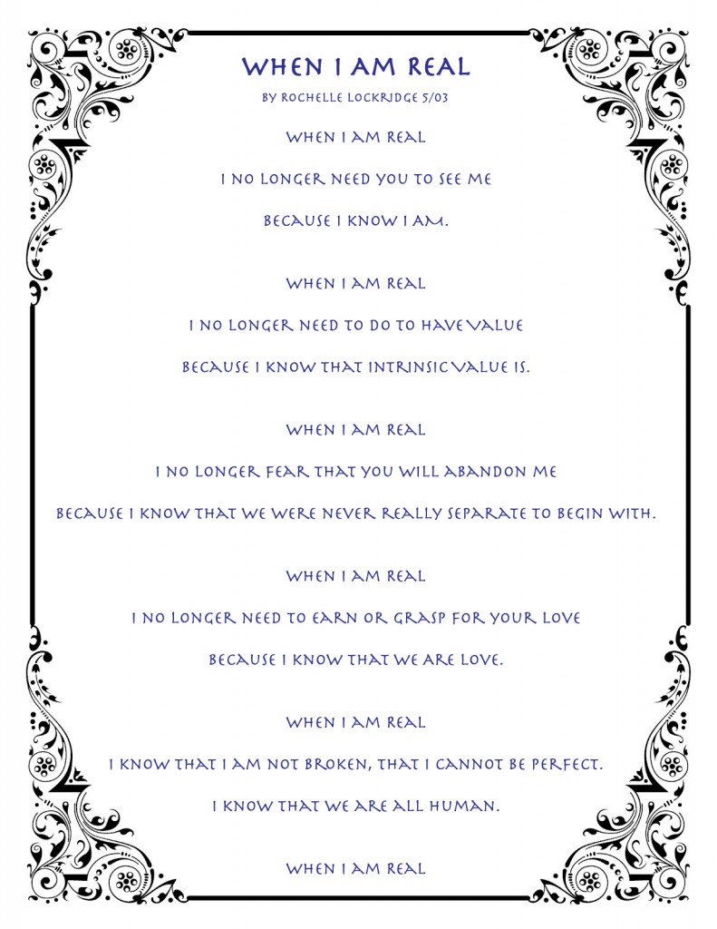
Here is one of my first poems written after my heart was opened to the beauty of poetry.

WhenIAmReal


Free Vintage Calligraphy Clip Art: http://vintageprintables.blogspot.com/2012/09/calligraphic-frames-and-borders.html

You can also read about how I made the borders on these images.  I delved into the HTML code in the text editor.  It wasn’t that bad…. Really.

The Chemistry of Creativity: Riding The Dopamine Wave

TDC Surfer

Surfer Dudette Riding the DS106 Dopamine Wave for TDC613

DailyCreateWebPicAlan Levine has been updated and tweaking the DS106 site quite a bit the last few weeks.  He’s been asking for people to test things out, trying some new formats.  You know… things like that.  Well yesterday’s DS106 Daily Create, TDC613, asked us to take a photo that represents the TDC idea of regular exercises of creativity.  It seems the current photo the site is using at the moment is getting stale.

I thought about this challenge throughout the day, but nothing was presenting itself to excite my creativity.  Then last night, at 10:30 pm, inspiration struck.  Man… I was planning on going to bed early…. but no…. my brain chemistry had now shifted into creative mode.

BrainChem_500px-Dopamine2.svg_-300x139

The chemistry of creativity – Dopamine on the brain

“Our brain chemistry is without doubt an unpredictable force and influence on our mood and, therefore, how creative we feel….Dopamine is the chemical that allows our brain to wonder and think-up new ideas (Flaherty, A.W* )…. It is known that dopamine gets trapped in tense muscles. Regular (and even gentle) exercise can help release this dopamine back in our body and brain.”  [Chemistry and Creativity]

SurferThat nice boost of dopamine inspired a repeat appearance of Surfer Dudette last seen surfing her way through my first stop motion video for tdc567.

The image I chose to create for tdc613 has quite a few layers, figuratively and literally.  Figuratively, you can tease out:

  • TDC SurferCreativity can be like riding a wave. You are focused, relaxed, alive, not really sure what’s coming next.
  • The DS106s could be seen as that wave of creativity that she is riding on.
  • She is sitting atop my old Nordic Track.  Real exercise helps to release dopamine trapped in your muscles back into your body.
  • The plant? Not sure… I placed it there as background to hide the fact I was taking the picture in my basement and wasn’t keen on having the furnace, ironing board, and dryer in the background.  Any suggestions on what it could represent?

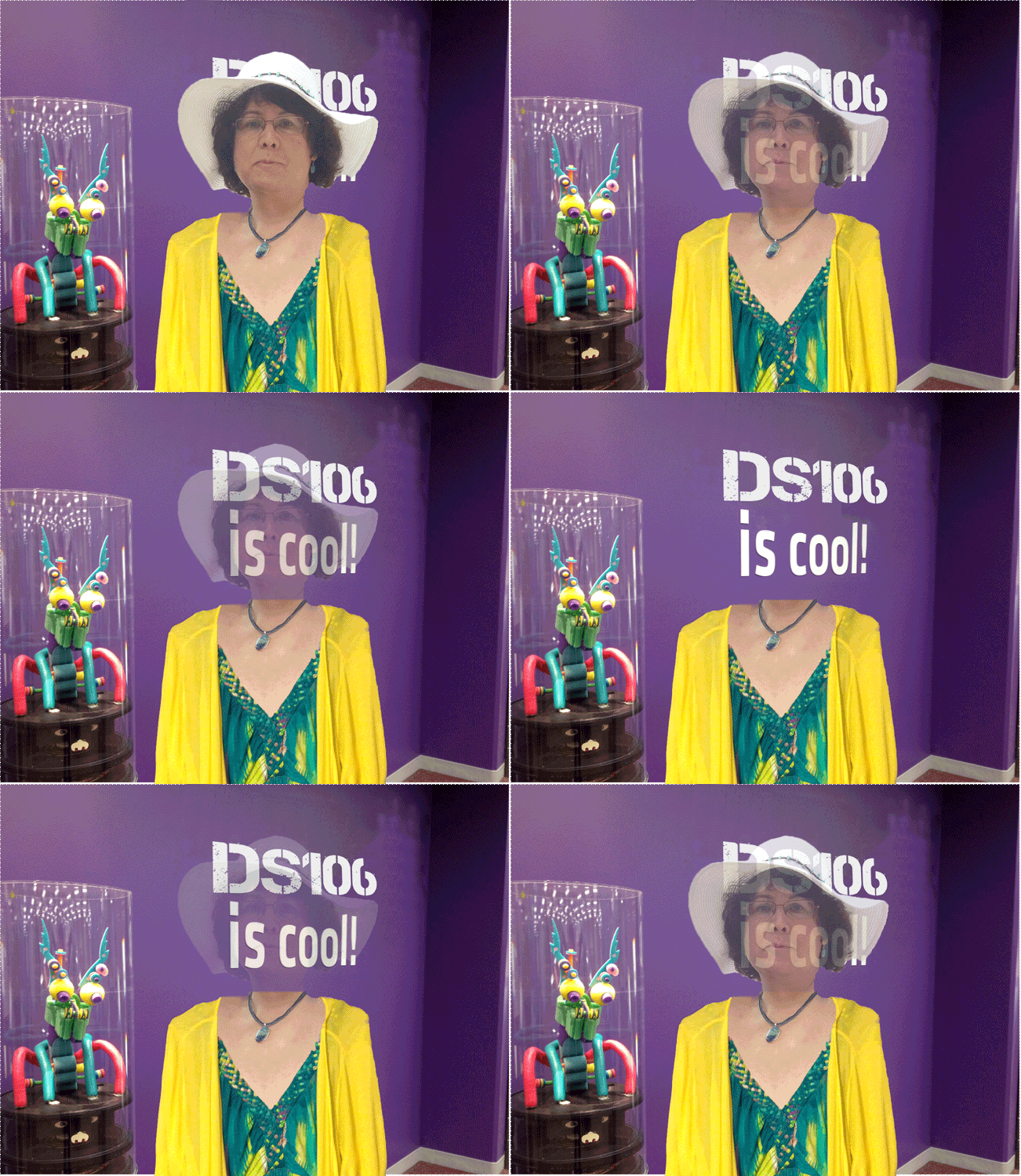
As for the literal layers… I made the composite image in Photoshop Elements 11 for the Mac.  I keep on-hand a PNG image (They maintain transparency unlike a JPEG) of the DS106 logo downloaded from the website.  I made 3 copies and rotated them slightly so they would align with the bar of the Nordic Track.  By dialing down their opacity to 80% they looked more natural.  At one point I became disturbed that I hadn’t dusted and cleaned everything before taking the photo, but it actually looks quite appropriate with the cracked overlays of the DS106 images. Everything looks a bit worn and not used in awhile.  Maybe I should add another layer of interpretation – that it’s time to dust ourselves off and get our creativity moving again.

TDC Surfer_deletes

Deleted sections of image in white

To make the DS106s appear as if they were stickers attached to the bar, I used the magnetic select tool to select various parts of the exercise equipment.  I copied and pasted each into a new layer.  Leaving me with a base image that had blank spots.

The three new layers were then placed on top of the DS106s.  For some unknown reason the new image layers turned out to be slightly smaller than the space where they were selected and copied from.  This has never happened before.  So I had to slightly increase their size.  Weird….

I’m almost “quite pleased” with my final product. It seems a bit off center to me. That golden ratio thing not optimized or something.  I tried to crop it, but couldn’t get it to look right and keep the exercise equipment in the frame enough that you knew that’s what it was.  I’m hoping design week will help me work on things like that.

TDC Surfer


Whatsa’ Story?

What is a story? What is storytelling? What is digital storytelling? Week 3 of DS106 Headless 13 has us asking these questions and exploring this for ourselves.

What do you associate with the word storytelling? Before you do anything this week, use this as an opportunity to put down in words what your current concept is. There is no right or wrong answer here- this is to set up your current concept of what story means.

Do not go look anything up online — We are looking for your ideas. Just write a blog post to represent a starting point to outline what storytelling means to you.

Wanting to understand and become a better digital storyteller is what attracted me to DS106 in the first place, so I’ve been doing some serious pondering all week.  And being challenged to NOT read anything about it before writing up my reflections has definitely been a challenge. I want to “get it right”, quote my sources, rely on the words and thoughts of others to form “my” thoughts and opinions. It’s hard for me to wing it like this.  But my DS106 participation (now winding its way through my private AND professional lives in a big way) continues to reinforce it is through taking risks and allowing myself to be appropriately vulnerable that I stretch my boundaries thereby allowing real learning to take place. I am not just learning new tools and techniques, but learning who I am and what I’m capable of.

So what is a story? And I’m supposed to do this with words only? But images are integral to a story, right?! Yes, images are integral. But they don’t have to be something seen with the physical eye.  Images formed in your minds eye are just as important if not more so. And visual images themselves won’t necessarily a story make.

In my professional life as a strategic business/technology analyst at 3M I am often presented with a great deal of data and information that needs to be communicated to a variety of audiences with different levels of interest and familiarity with the subject matter. Sharing the raw data, as it were, would almost certainly be a waste of time for everyone. It’s my job to “COMMUNICATE” that information, not just gather it and spit it back out again. I am paid to be a curator of information AND a storyteller. It is the story I create and tell that is based upon that data and information that is the key. Even the media I use to tell the story has an impact on the effectiveness of communicating the information. With a global asynchronous audience I can’t rely on personally sharing the story in real-time with a live person in attendance who is engaged in the moment, that can ask questions, get clarification, etc. Mastering the art of DIGITAL storytelling is a must for me.

Storytelling is usually associated with entertainment.  But you are still communicating. It’s not just a bunch of random words, images, or sounds strung together. They are brought together in a way that creates meaning for the creator and the audience- whether it be to entertain, relay information, or my preference, both.  A good story take us on a journey. We are engaged.  We are impacted by its telling.  A story has meaning to our lives.

A Trailer For Two

Link to Rockylou Productions Trailer


RLP_Creativity_GIFDuring week 2 the DS106 Daily Create TDC607 challenged us to create an exciting movie trailer for our DS106 website and use “the voice”.  Wanting to make the most efficient use of my creative time, I decided to modify the project so that I could use the art I created in real life.  So I made a more professional looking trailer to highlight Rockylou Productions as a whole and how it is actualizing our vision of cultivating creativity and raising visions.

I had started out contemplating how I could make the trailer with iMovie.  But the only semi-workable option was to use the version I had on my iPad. I skipped upgrading my desktop version to iMovie 11, which was supposed to have that functionality (I still have ’09) after reading the absolutely horrible reviews given by current users.  So I did a trusty Google search on creating movie trailers and found a YouTube video tutorial on “How to Create a Movie Trailer For Free

That led me to a site called Flixpress.Com. There you could choose from a number of trailer templates.  I checked out the free ones and chose the Icy Spin T9 template which allowed me to have 8 images, and title text at the beginning and end of my trailer.  In theory this should have been a no-brainer. Just pop the pictures in and away you go.  But no…. that’s hardly ever the case.

Choosing my eight images was pretty easy.  I wanted to highlight the my Rockylou Productions projects that exemplified “Cultivating Creativity” and “Raising Visions”.  Once found I needed to format them to the requested 600 X 400 px within Photoshop CS5. But upon preview I found out the Icy Spin T9 template actually crops the images to 600 X 349 px.  Fortunately most of the images could be cropped without a problem.  Only one, Obruni, had to be modified significantly to make it fit correctly. I ended up creating quite a few draft versions before things clicked for me.  Maybe if I’d paid for the pro version I would have had more editing capabilities with my project, but for free I had to start over again from the beginning every time.  PAIN!!!

Saving your file puts it into the system for processes and in a minute or two they send you an e-mail that lets you know your video is ready for preview and downloading.  For free you get 640 X 480 SD resolution.  NOT IN MY WORLD! I ended up paying $2 to have an HD version made, since I wanted to import it into Adobe Premiere Elements 11 to add a music track and the Rockylou Productions animated Logo/ bumper at the end.  (I actually spent $4 because the photo order mysteriously shifted with the first purchase.) I made a conscious decision to not add “the voice” as I felt it would have been a distraction.  It reminds me of an anecdote I heard recently from a DS106 talk (sorry I can’t remember which one, either Gardner Campbell or Jim Groom) about a kindergarten teacher whose students always had the best art projects in school. When asked how she did it, she said she knew when to take it away.

If you’re interested I’ve included below an overview from previous post on how the animated logo was made.

I’m pleased with the final product and have already posted it on my Rockylou Productions page on Facebook.

Music: “Find Your Style”, Newline variation, by John Defaria
Smart Sound Personal Use License purchased from the Vimeo Music Store for $1.99

=>Rockylou Productions Animated Logo

RLP_Logo_27lvs_Bw-ColThe Rockylou Productions animated logo at the very end of the video was created by incorporating a dissolve transition between two logo images designed by Amber Lockridge.  Transitioning from b&w to color with a slight increase in the size of the color graphic by 1%  is meant to give the illusion of growth and expansion, an important value statement for Rockylou Productions.

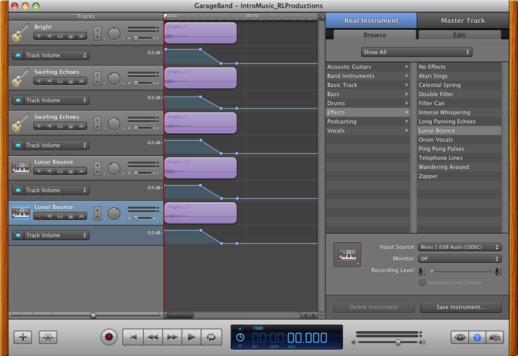
The audio logo for Rockylou Productions was made with GarageBand and a simple “D” chord that I played on my 12-string guitar.  I took the original recording and added a Bright Guitar effect to the basic track.  I then duplicated the original track four times, and added dimensionality to the chord by adding a Lunar Bounce to two (panning each slightly left and right) and a Swirling Echo effect to the two remaining tracks, also panning them slightly left and right. With the addition of the Ambient – Wide Spaces effect to the master track the memorable audio logo for Rockylou Productions was born. 

RLPChord_GB


What did I do in Week 2?

FdeTroyLectureMoliere_DS106-3MWhat did I do in DS106 Headless 13 Week 2? Tried to keep up with essentially two courses of ds106 at the same time, and it’s stretching me to the limits.  I’m learning tons setting up the 3M-DS106 Salon’s cyber-infrastructure behind the 3M firewall.  And continuing to experience a lot of frustration as I come up against technical obstacles with the 3M systems that I know I can do here on my WordPress blog, in Twitter, in Tumblr, on Flickr and YouTube.  But the small group of brave souls who are taking this journey with me are jumping in, starting internal blogs, commenting on one another’s posts, sharing their skills and workarounds, creating headless self-portraits, and GIFs –  even had an unexpected GIF riff today with a Koala bear that wanted to blink.  🙂

HCHeadlessGIF

The 3M-DS106 Salon going headless.

I just have to share the headless self-portrait created by one of the 3M-DS106 Salon members, HC. He had followed the advice to take two photos- one with him in the picture and one just of the wall.  He hadn’t counted on the lighting casting a shadow against the back wall. With GIMP he created two versions which I’ve ‘riffed into a GIF’ to illustrate the differences. When asked which we preferred I was torn. I’m certainly familiar with the flat no-head-at-all version, but his shadowed headless self invokes in me the realities of the work that goes on behind the scenes in any collaborative effort.  There are always leaders in some shape, way, or form, but they may not be visible.

BLOGGING

“Each blog post must be able to stand on its own as something that makes sense if that is the only thing a visitor reads on your site.”

I’m getting a lot of practice blogging these days, and I found the blogging tips very helpful:

DAILY CREATES

Some of us who have been through a round or two of ds106 know the realities of balancing a full-time job, family, friends, and the addictiveness of being an open-online participant in this digital story telling community.  We were joking about the three R’s could be “Reduce, Reuse, Recycle”.  You can read all about how I’m using these to try and keep my balance and sanity as I manage all of my responsibilities. State of The Daily Create – wk2

“IT’S SHOWTIME” WITH A DIGITAL STORYTELLING GIF

BeetleJuiceGIF_2

One of my favorite movies of all time and characters is Michael Keaton as Beetlejuice.  The ghostest with the mostest.  This 1988 comedy horror film directed by Tim Burton is a scream and I’ve always thought quite romantic too.  [Wikipedia Post] There are indeed headless ghosts running around from time to time.  But none of those scenes seemed as appropriate to sum up the movie and capture the essence of a key scene as when Beetlejuice, a self-proclaimed “bio-exorcist”, is being released from his exile in a small model town in the young couples attic. Indeed… It’s Showtime! Including a post on how I made the GIF.

Removing GIFFight for 3M 

Headless Over Heels In Love 

Shared from rockylou22 using Embeddlr

Picking up the GIFFight challenge this week turned out to be a double edged sword.  I had no problem creating and posting my “Headless Over Heels In Love” GIF. But a serious issue arose when another GIFFighter, not in DS106, posted a GIF that I feared could be labeled as sexual harassment by someone viewing it from 3M. This prompted the e-mail exchange below with one of our ds106 headless mentors.

I’ve been struggling with this decision since the 80’s toys poster GIFs. The drug & sexual references in a couple of the GIFs are not appropriate in the corporate world. The latest naughty GIF could even get me in trouble for sexual harassment. I know the guys are just having fun, but I take my professional responsibilities seriously. I’m going to remove the GIF Fight assignment references from my 3M version of the weekly assignments.
I don’t feel I have any right to ask the GIF Fight guys to not post those kinds of GIFs since this is their game &  I am just a visitor.  These are some of the consequences we run into with the open nature of the course. How have you guys handled stuff like this in past DS106 courses?
Sincerely,
Rochelle
****************************
Rochelle,
Perfectly understandable. First of all, not everything listed in each week’s laundry list is necessary; it is more of a buffet than a required consumption list. GIFFight was an add-on; the real challenge in this week is asking people to figure out how to create an animated GIF w/o us providing explicit directions.
It could be a lot worse. A lot. But this is the flip side of a class on the open internet. We had a case in 2012 where some male students did a radio show played in class that had some offensive content to women. It led to some hard but good discussion on grounds of decency.
But for the most part we have avoided as much of this that could easily happen.

Gardner Campbell Golden Treasures

Brain_AliensFiguring out how I wanted to share my reflections on Campbell’s article and videos took some time.  My first attempt had me making a little GIF from a discussion point about the work of John Medina on the human brain.

After seeing Mariana Funes use the Tapestry app, I wanted to give it a try.  It seemed like an interesting new platform to capture my notes from the Gardner Campbell 2012 discussion with a group of UMW DS106 students. And I tried to incorporate my little alien presenter. It turned out “okay” – nothing to write home about though. Next time I make one, I’d like to add more images to the mix and figure out the best animation speed when adding a GIF.

UPDATE: 9/11/13… Imbedding the tapestry story so that it work across multiple operating systems, browsers, desktops, and mobile devices is proving to be an issue. I’m trying to figure it out and will keep an updated list of ways to help you see the story.

  • You may need to refresh the page to have the story show up.
  • Try a different browser.  I know Goggle Chrome works for me.
  • By refreshing the webpage on a desktop computer you can return to the beginning of the story when finished.
  • Here is a direct link to the story in Tapestry:
  • Link to the story posted in Tumblr:


Shared from rockylou22 using Embeddlr
download/iPhone

DS106ish Elegance

For my week 2 DS106 Headless 13 summary I created a separate summary post for all of my daily creates from that week.  It’s not only highly recommended, but I find it helpful to my own learning to write-up my process while producing my projects and share those learnings with others. The bulk of the daily create projects were very straight forward or I was recycling a previous project that already had a process post.  But one of them, (actually two combined into one.) really should’ve had a full write-up completed and here it is.

I was quite pleased with my brilliant use of the reuse principle by combining two daily creates into one photoshoot.  tdc601 asked us to draw something DS106ish backwards in recognition of 601 being the reverse of 106. Here I’ve drawn DS106 backward again on my iPad with the Paper53 app.

Backward Glance at DS106

In combination with my submission for tdc602 capturing the elegance of Apple products that are designed with elegance in mind from the device to the packaging right down to the details of the insert materials.  It is an experience just to open the box for an iPad or an iPhone.

Elegance in the 21st Century

A very simple GIF was also added to the mix.

DS106 Elegance for tdc601

Shared from rockylou22 using Embeddlr

DS106_Elegance_AThe photos were taken with my iPhone and the Camera+ app.  I used two photos. One with the iPad turned off while positioning myself so that the overhead lighting would cast my reflection in the screen.


DS106_Elegance_Yellow

The second photo was taken with the iPad on and the image of the backwards DS106 I’d drawn in the Paper53 app visible.  There was a problem though.  I didn’t know how to set and lock the white balance, so the second image with the DS106 had a very yellow tone that did not look elegant at all.

To make the GIF work I used the magnetic select tool in Photoshop CS5 to select, copy and paste into new layers, and then remove the screen from both images leaving me with a blank transparent screen.  The screens were placed into new layers and I used only the nicely white balanced photo as the base for the GIF.

DS106_Elegance_BlankBut another issue now cropped up. Look closely at the iPhone box on the left-hand side of the two original photos.  It overlaps the screen a little.  In the blank screen image it has been cut off.  To remedy this visual anomaly I used the select tool to select the overlapping corner of the box  then copy and paste it into a new layer.  That corner layer was placed atop everything else.

Next I created screen layers of the  with varied opacity in 10% increments. The animation duration for each frame was set to 0.2 seconds except for the full on and full off images which were increased to 1 second to allow the viewer to experience those images more completely. The GIF was reduced to 500px width to keep the file size down but I kept it at 256 colors to preserve the elegant look of the images.

One final note…. My WordPress theme wouldn’t embed a Tumblr post by just inserting the URL.  A search on the internet found a site, Embeddlr,  that will generate the embed code that I used above.  Handy little tidbit to have on hand.

State of The Daily Create- Wk 2

It’s week 2 of the Headless 13 dS-106.  While we were finishing up boot camp and continuing to build and personalize our personal digital cyber-infrastructure, we were also having some fun along the way creating GIFs and doing some daily creates.

Some of us who have been through a round or two of ds106 know the realities of balancing a full-time job, family, friends, and the addictiveness of being an open-online participant in this digital story telling community.  We were joking about the three R’s could be “Reduce, Reuse, Recycle”

REDUCE: I try to work smarter by choosing foundational media that will be easier to manipulate technically if I have limited time on my hands. i.e tdc609 showing the “coolness” of a refrigerator.  Lassoing that refrigerator was so easy, plus no need to extensively rebuild background with these images, that I ended up creating two photos. 🙂

What do we do with this thing? This long lost outtake from the opening scene of “2001 A Space Odyssey” wasn’t quite what Stanley Kubrick had in mind.

What do we do with this thing?

That 1969 refrigerator was so cool it was selected to fly to the moon with the Apollo 11 guys. But there were a few glitches in getting it hooked up.

Apollo 11 Fridge Debacle

I may choose to not make a big production out of a project, even though I could have for tdc603 when making a video to tell the story of my keychain that gives a deeper look into who I am.

I also continue to toss aside my perfectionism and let my technical vulnerabilities be seen in public as I shared with the world my limited ability to draw a 3D perspective for tdc606. I’m using the Paper53 app on my iPad.

3D Drawing Skills

I was quite pleased with my brilliant use of the reuse principle by combining two daily creates into one photoshoot.  tdc601 asked us to draw something DS106ish backwards in recognition of 601 being the reverse of 106. Here I’ve drawn DS106 backward again on my iPad with the Paper53 app.

Backward Glance at DS106

In combination with my submission for tdc602 capturing the elegance of Apple products that are designed with elegance in mind from the device to the packaging right down to the details of the insert materials.  It is an experience just to open the box for an iPad or an iPhone.

Elegance in the 21st Century

A very simple GIF was also added to the mix.

DS106 Elegance for tdc601

Shared from rockylou22 using Embeddlr

UPDATE: (9/10/13) The above daily create duo now has a project process posted: DS106ish Elegance. There were a few little tricks to getting the images and GIF to look nice that I thought should be captured.

REUSE: I use pieces of past projects too. Either from another ds106er, an on-line source like Microsoft Clip-art or free image and GIF sites, or from my own art collection. Like this photo of my grandson actually taken the day before tdc605 was announced.  I’ve captured the calm amongst the ever lurking emotional chaos of the typical two year old. My grandson DJ looks so sweet and adorable here. And he is… most of the time. But those tantrums can come & go at anytime.

Calm & Chaos at Two

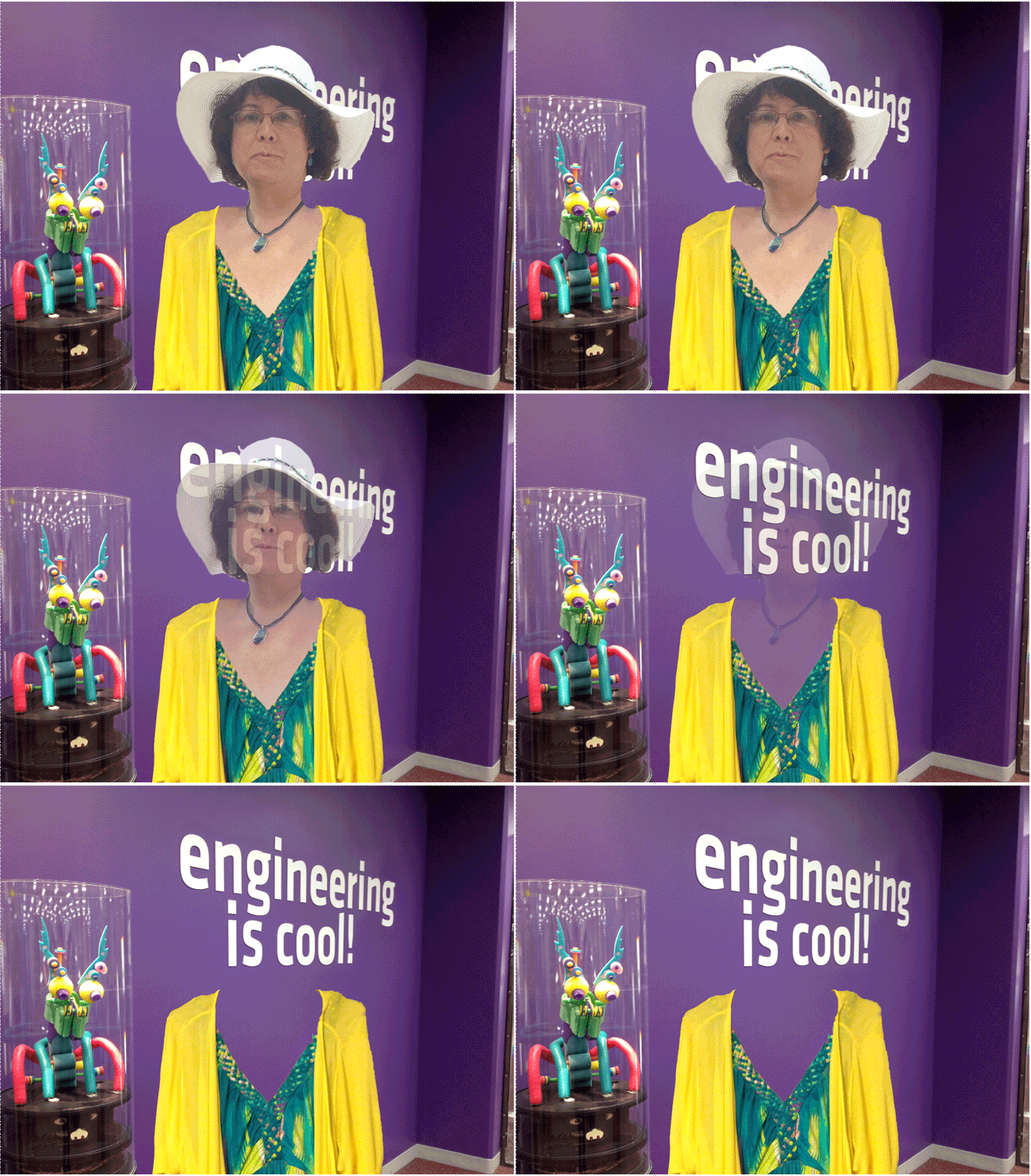
Headless_Rockylou_3_GIF_Final_500RECYCLE:  Not sure if this would fall under Reuse or Recycle, but either way for tdc604 my headless self-portrait was created a few weeks back for one of @IamTalkyTina’s August GIF Challenges.

Read all about how I created the GIF and the image at:

Engineering Headless Rockylou

There was one final daily create, tdc607 “Create an exciting movie trailer for your ds106 web site. Use The Voice.” that I really wanted to do. But due to my youngest daughter getting married this weekend, that balance of personal time and ds106 weighed most heavily onto the family side.  I plan on doing it this week though.  I have some ideas floating around in my head I’m excited to try out.