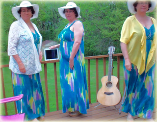
I was cruising the DS106 visual assignment choices for something that looked fun and challenging – yet would only take a couple of hours to complete. The MULTIPLY YOURSELF assignment (Take two or more photos of yourself in the same location and combine them into one photo.) really jumped out at me. And it was worth 5 stars!
The project unfolded in three phases. (Animated GIF illustrating the image evolution)
Phase I woke me up in the middle of the night, my mind wouldn’t rest as it started planning how to set-up the shots so that the photo editing phase would be easier to handle. I initially contemplated enlisting the aid of my partner or daughter to snap the shots, but then decided to take on the challenge of doing this all by myself from start to finish. I decided to use my FlipVideo camera on a tripod to take video footage of me in different places in the frame. Then I’d capture still images on my Mac with Adobe Premiere Elements 11 and meld the images together in Photoshop Elements 11.
Phase II was all about setting up the location, shots and shooting the video clips. I tested a few different scenarios before I had something I thought would work. I added interest and personality to the mix by wearing something a little different in each shot. (As an aside, just in case I wanted to use the video later to make a “live” version of the photo, I made sure that I entered the shots from different places in the frame so that I wouldn’t cross over into another shot when I melded them together.) The weather outside cooperated by not being too windy, the overcast morning meant I didn’t have any shadows, but I still needed to work quickly as it looked like rain was on its way.
Phase III was spent putting it all together. I downloaded the video clips into Premiere Elements 11 for the Mac and selected several still images from each of the three “Rochelles”. I was a little dismayed that the resolution of the images wasn’t all that great. My decision to do this assignment without a helper or the need for a timed shot delay function was now suspect. I would have had higher resolution images if I’d used my regular digital camera on the tripod instead of capturing the stills from the FilpVideo. Alas, as I’ve found so many times before, creativity abounds when I’m seemingly “stuck” and need to find another way out. Not wanting to set everything up again, I moved forward with the “sub-optimal” material I had before me. I trusted everything would work out. Besides, I’m one of the online outside participants of the course, and there’s no real grade at stake here. 😉
I diligently went to work cropping and blending my three images into one. It was fairly easy except that the center pose lighting was slightly lighter than the two outside images. Why?? I haven’t a clue. I shot the entire video in one 4 min session and the lighting matches at both ends. Maybe the clouds thinned a little or something half-way through?? Who knows…. To fix this I used Enhance=>Adjust Lighting=>Brightness and Contrast on each of the 3 poses until they matched as best I could get. While playing around I chanced upon a combination of adjustments that slightly blurred the photo even more and suddenly it looked great. As usual I don’t exactly remember what I did to make it happen… it was “Magic”. Finally, I wanted to give the photo a border of some kind. I like to play with all of the dials and sliders to see what shows up. EUREKA! The combination of Edit Layer Style=>Glow Inner=> Yellow was perfect.
I now have a beautiful feathered yellow glow surrounding my ManyMe photo that matches the yellow jacket I am wearing. Yippee!
Watch an animated GIF visually illustrating the evolution of the image.

