Category Archives: Assignments

Obruni Arrives in Africa – Sound Effect Story (Slight Variation)

[soundcloud url=”http://api.soundcloud.com/tracks/94573148″ params=”” width=” 100%” height=”166″ iframe=”true” /]

Amber arrives in Ghana, Africa. The new “Obruni”, or white person, both delights and scares the young children of Takoradi, and she soon discovers the way music can transcend cultural divides. Listen to the original full length podcast episode the sound effects were taken from at http://rockylouproductions.com/2010/10/18/obruni-take-it-up/

Audio editing is not for the faint of heart.  Especially if you can be a perfectionist or have a tendency towards OCD. [Guilty as charged…]  You can fiddle around and fine-tune forever.  (Note: The audio clip attached happens to be an updated version from what I posted earlier this morning.  I didn’t like that the car racing by in the beginning was inaudible on my iPhone. So I fixed it!)  But it can really be worth it when you come back months later to a piece you created and go, “Wow, I did that?”  

Inspired by LoDown episode 8, I jumped in to create my own sound effect story – Audio Assignment 70 with a slight variation of having a bit of spoken and sung text.  The assignment asks us to create a 90sec or less story with at least 5 sound effects.  I decided to use sound effects I had from a podcast I had created with my daughter, Amber, in the fall of 2010.  We really didn’t know what we were doing back then at moving her stories off the written page and making them audible.  I didn’t have any experience with sound editing software, and I didn’t even know what a Podcast was.  Amber had to suggest listening to StoryCorps and WYNC’s RadioLab to help me become familiar with the genre we were embarking upon. 

I’m a big Apple fan and went with GarageBand as my sound editing tool.  I wasn’t up to the VERY steep learning curve for the more professional stuff. (And I hadn’t heard about Audacity. I’ll have to check it out at some point during the course.)  I have plans for a future blog post (possibly a series or a LoDown co-hosting gig) that will go through the creation process for the entire podcast episode, but for this post I’m going to stick to the sound effect story.

A story needs to have a beginning, middle and end- now doing that in 90 seconds can be a challenge.  Finding the right sounds, keeping in mind copyright issues, [link to my YouTube playlist on copyright and creative commons] is also a big challenge.  We used freesound.org, pulled sounds off of creative commons YouTube videos, and even created some of our own sound effects if we couldn’t find what we wanted. But again… that’s a story for another blog post.  My storyline for my sound effect story could be an audio trailer for the larger podcast.  The over arching story is about how the people of Takaradi, Ghana reacted to this new white person in their midst and how she responded.

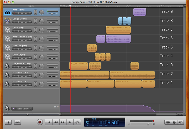
Let me take you through at least a portion of my process. Below is a screen shot of the final GarageBand file. I like to build my layers (technically called tracks) from the bottom up when possible. That way I know where I’m at, and it makes sense to me as I layer on my sounds. So that’s how I’ll be referring to them as I move along.

GarageBand Screen Shot

GarageBand Screen Shot of sound effect tracks only

Setting the Scene (track 1 & 2) To set the scene we used a lively chaotic market place sound effect that is actually a combination of two different sound effects grabbed from freesound.org.  (Called Market Place 1 and Market Place 2 above.) Neither of them sounded right alone, but the combination was just what we wanted.  Experimenting with different combinations is a great way to find just the right sound you are looking for.

The first “event” in the story was the addition of a car racing by on track 3. Remember I’m counting from the bottom up. If you listen with headphones or good speakers you’ll be able to hear the stereo effect as the car goes whooshing by.  There are things happening in and around the market place.

Our story gets more personal when track 5 brings in the children laughing, while track 3 changes over to shouting out “Obruni”.  Both of these effects were pulled from YouTube videos. So… why you might ask don’t I put each sound effect on its own separate track? (Track 3 has 3 different effects.) Because it’s a visual nightmare when you have to keep scrolling the screen to see where you are at. I try to limit the number of tracks I need to what can fit on my computer screen.  For our big podcasts that almost never happens -but we try. And labeling your larger tracks with something you understand, as well as the individual clips, is a good practice.  All things we learned the hard way!

With track 4 we hear a child crying and Amber fading in, softly humming “Amazing Grace”, to soothe the little one on track 6. Track 6 continues and morphs into Amber actually singing. With track 7 the choir joins in. Amazingly we found this little, slightly off key (just what we wanted) choir with a YouTube search. A set of congo drums joins the party on track 8.  Then it’s back down to track 3 with the audience applause.  Our final track 9 brings the story toward a close with Amber singing alone again.

I very purposely chose segments of the sung lyrics to coincide with an event in the story or a feeling I wanted to impart. The child is crying, Amber hums then sings, “that saved a wretch like me.” Amber is then saved by the choir joining in. I could have used the humming again at the end, but concluding on “Amazing Grace, how sweet the sound…” was just too much to pass up.  Like a good poem, there are many layers of meaning that can be interpreted by a listener.

At the very end the market place sounds coming back into auditory focus to take front and center stage.  Life continues on with one final master fade out.

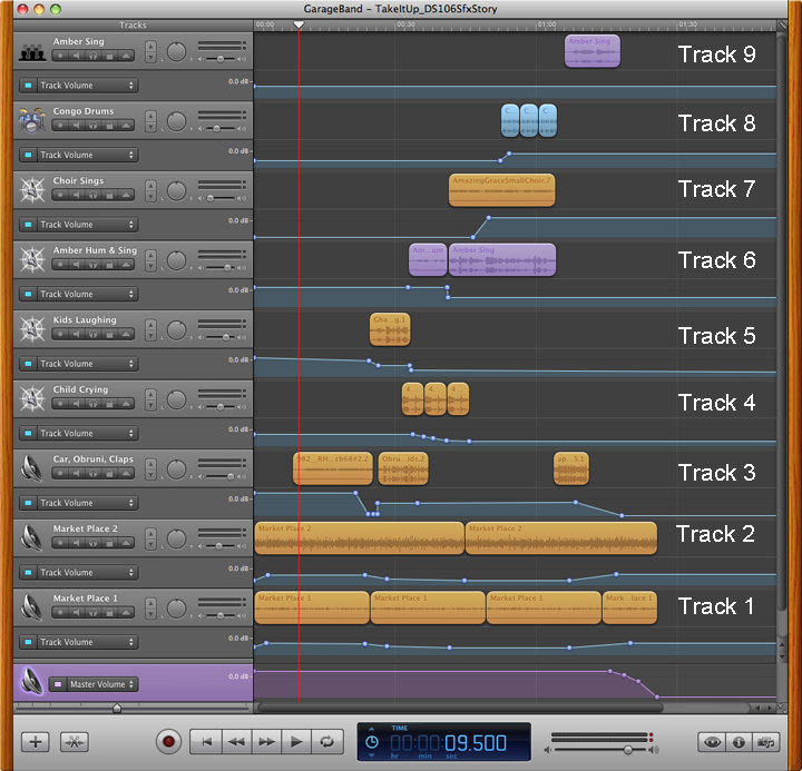
Fine Tuning: But least you think we are finished… Oh No… you would be wrong.  You can consider this version of the audio file a rough draft.  But at least these aren’t just end-to-end clips. I’ve talked about some layering here. How these sounds are in relationship to one another is a big deal.  Blending one sound effect into another and adjusting the volume balance between clips can add a lot to your story.  Panning the sound effect into one ear or the other or the stereo effect like the car racing by are nice details to add.  You have to be careful with this though.  You don’t want to end up making your listener dizzy because what they are listening to doesn’t make sense. With the screen shot below I’ve opened up the track volume areas so you can actually see what I’m talking about.

GarageBand Screen Shot

GarageBand file with volume track shown

Track 1 & 2 market sounds fade in at the very start. We don’t want to alarm our listeners with an abrupt beginning. The idea is to create and maintain a listening experience that someone wants to join and hang-out in. If it feels “chunky” (as Amber & I refer to it) anywhere in your audio file your listeners will pick it up.  Maybe not consciously, but they’ll know something isn’t quite right.  Choke back the false pride and fix it!  You’ll be glad you did.

I made sure the track 3 car sound effect faded out nicely so you knew the car was fading into the distance. And the clip we used for the kids laughing on track 5 had an erratic volume level.  It was too soft at the beginning, so I bumped it up and brought it back down toward the end of the clip.

When the child is upset and crying (track 4) at seeing this person with a different color of skin than her own, she cries full on.  Then her effect begins to trail off as Amber’s humming effect on track 6 crosses over.  At this same time I reduce the background market audio (tracks 1 & 2) so that the listener is able to focus on the next event in the story.  But since my story takes place in a market place, I don’t want to mute it completely.

As Amber is singing (track 6) the people in the market place gradually join in (track 7) and then someone fades in with a beat on drums (track 8).  I get a sense of a subliminal cadence that I follow to get the timing just right.  (When that “chunky” feeling pops up that I mentioned above, I’m most likely out of step with the piece and keep tweaking till it feels right.) We then linger here just a bit on this climactic moment of the story before the the audience claps. (Back down to track 3.)

The clapping trails off, and Amber returns alone,(track 9) but this time with a more ethereal sounding tone. That’s why this clip was placed onto track 9 instead of remaining on track 6 with the other Amber clips.  I wanted to modify the basic sound effect to give the feeling of a dream or fade away into the distance.

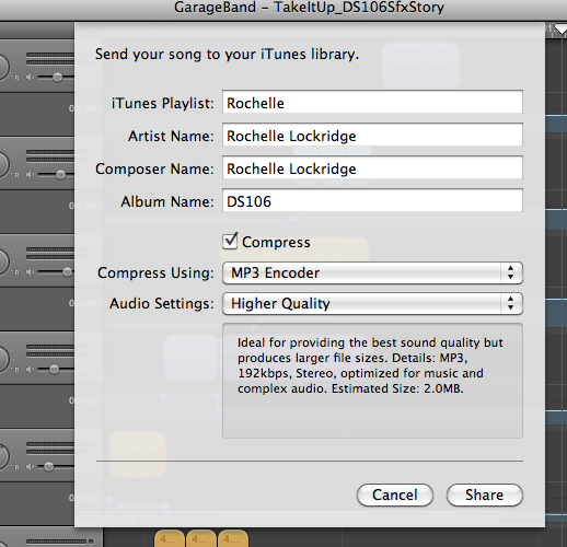
There is more mixing and “Mastering” of the final audio that happens next to give your audio file more life, but I’ll save that for another post. As well as going into how to export your file so that you aren’t shocked at the low sound quality that you disappointingly ended up posting.  Scott Lo and I are contemplating a LoDown episode for audio week 3 entitled, “How come what I posted doesn’t sound like what I made?” Any interest in that topic? In short it has to do with the audio file compression you need to do so people can download and listen to them on your mobile device.  This 90 sec story uncompressed (AIF) is 23 MB, while the compressed MP3 that you listened to above is only 2.9 MB.  And it could be even lower if I used the standard bit rate compression of 192 KB rather than 256KB which I prefer.

192KB MP3 Compression Settings

Typical “High” quality compression rate settings for GarageBand.

Okay… That’s going to wrap up this post.  It’s time for bed.  Let me know if you have any questions or would like me to explain in more detail how I did something.  Hopefully I’ll have the time to write up more posts on the subject.

GIF Evolution of ManyMe


The Evolution of ManyMe

The Evolution of ManyMe

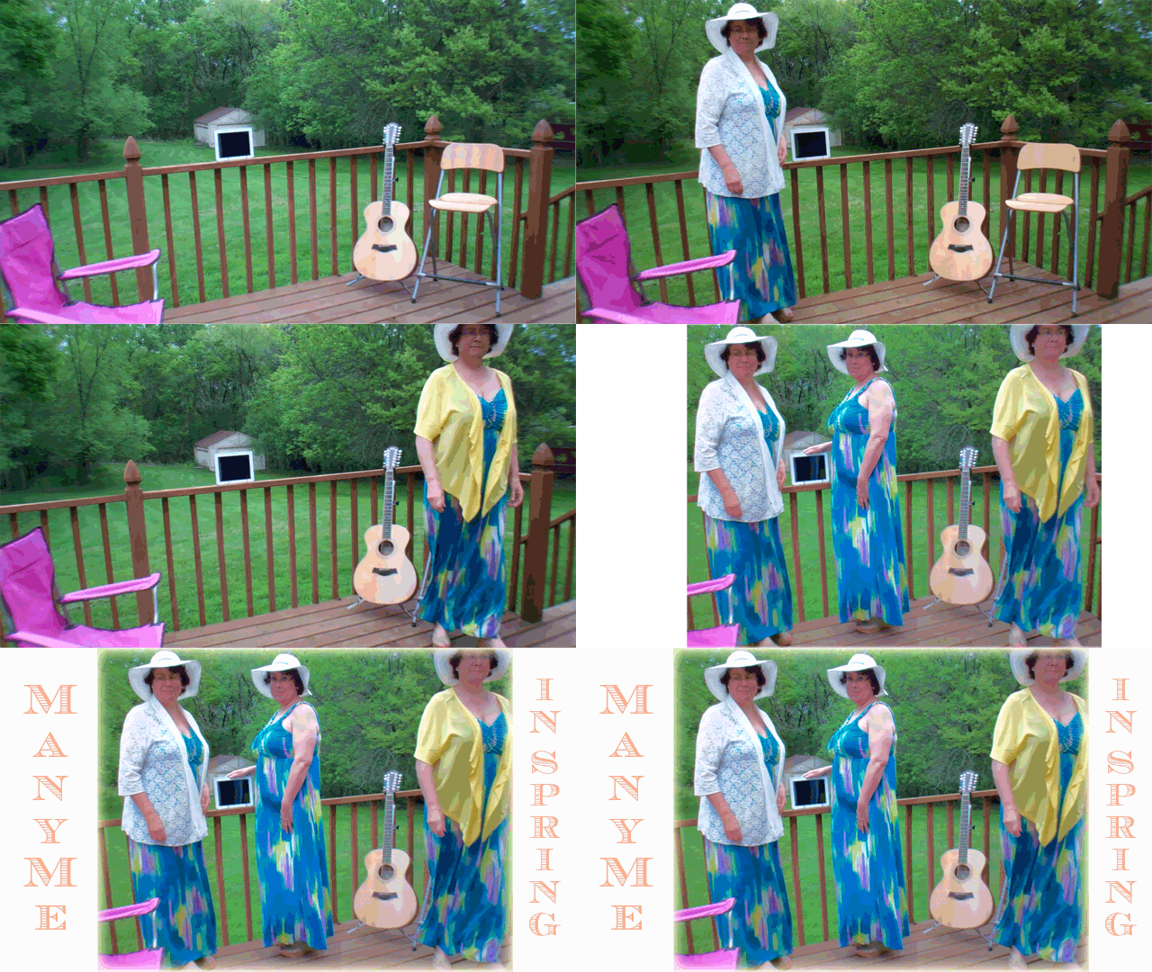
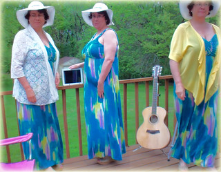
Inspired by my recent DS106 assignments I decided to take two of the projects I had completed this week, ManyMe and Go Daddy_Wheee, and use the skills and final products I created to visually illustrate the evolution of my ManyMe photograph. (Assignments: Multiply Yourself, Animated GIF) The objective of the Multiply Yourself assignment was to take two or more photos of yourself in the same location and combine them into one photo. I’m going to go one step further here and label this GIF project a completion of the “Photo It Like Peanut Butter” visual assignment 347 where we’re instructed to:

Use a GIF to illustrate the generation of a real world object/place by using your own series of photographs as the source material.

Phase I: The original images to work from were pulled as still frames from a 4min video taken walking in and out of the frame and placing myself at different locations.  (See earlier post for more background.) When making one of these photographs it’s important to have your camera on a tripod and that you get your shots as quickly as possible so that the lighting doesn’t change drastically.  If you have a controlled lighting environment you don’t have to worry about it.  Just make sure your background isn’t changing. )

Phase II: Using Photoshop Elements I cropped the single image shots.  I had strategically planned my placement in the photographs so that I could do a simple rectangle crop by making sure I hadn’t crossed over into another shot’s field. The guitar, iPad and chairs were my boundary markers.  No messing around with a tedious Lasso Tool.

Phase III: Next came the adjustment and fine-tuning of the cropped images for alignment and lighting.  Yes, even though I took the video in under 4min on a very overcast day, the center image of me was brighter than the two outside images.  Go figure!  I also didn’t like the diminished resolution quality of my images since they were taken from video footage in rather poor lighting.  Fiddling around with a few filters I found a combination that brightened and slightly blurred the entire photo that I found appealing. (Although my daughter later confessed she didn’t like the effect.  She thought it made me look like an alien and the image had lost its warmth.) As a final touch I cropped the entire merged image (attempting to improve the photo composition) and then created a fuzzy yellow border that complemented the yellow jacket I’m wearing in the right side image.

Phase IV: Creating the GIF… I gathered and organized the needed photoshop layers from earlier in the project into one new file.  Again, making sure that the alignment between images was spot on took some fine-tuning.  I didn’t need to worry about the lighting this time, since I wanted to show those changes if they were there. Once I had it assembled and previewed the first GIF, I noticed that I wanted it to run a bit slower so the viewer could take in each of the image changes more easily.  This was to show an evolving process, not just a quick action clip. I increased the overall frame rate to 0.8 seconds and cloned the initial empty frame and final frame to allow for lingering even a little longer on those shots.  The addition of the title text at the end capped it off nicely.

ManyMe_GIFTutorial_Titled_4X6

Go Daddy…. Wheeeeeeee

DaddyDJSlide_GIF_Short

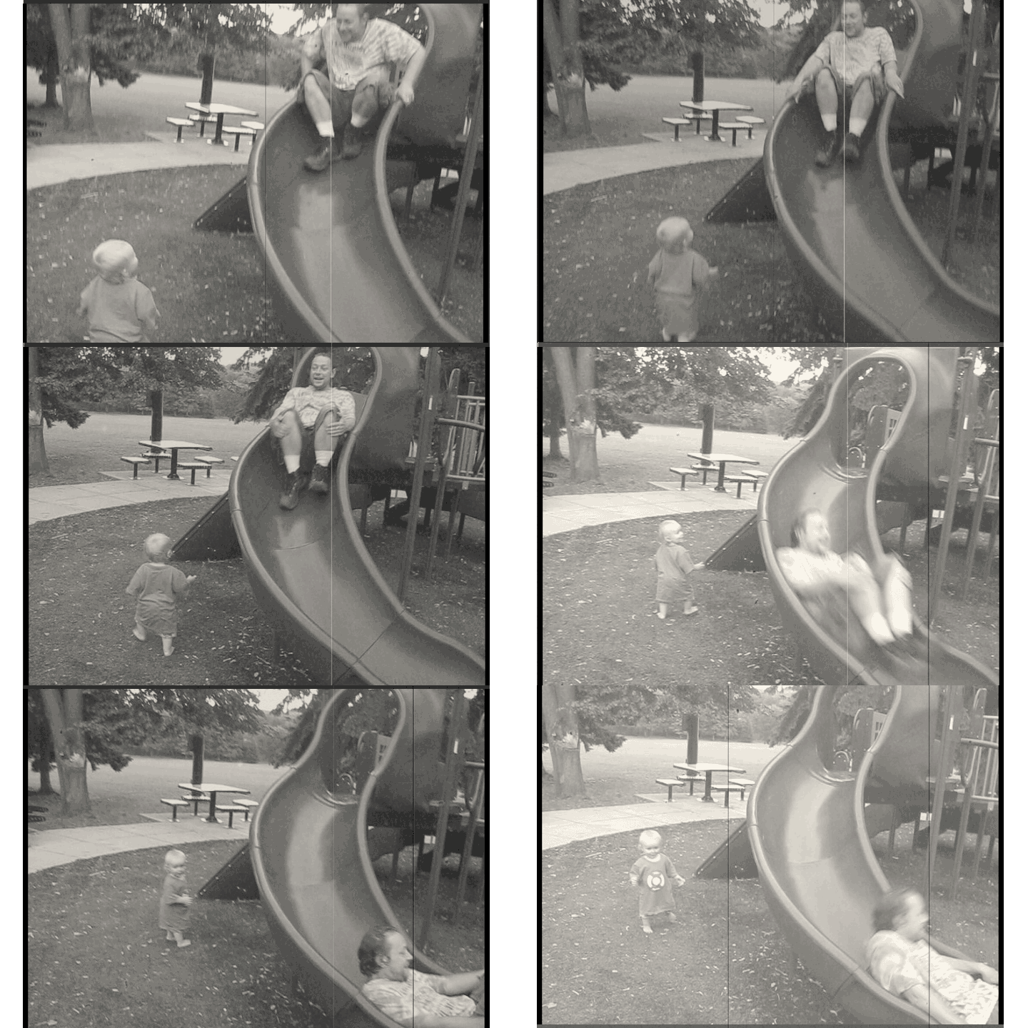
Grandson and son-in-law having fun last summer at the park.

Our only required DS106 assignment this week was to create an animated GIF from a Twilight Zone episode.  Me bad… I didn’t use a Twilight Zone clip…  But according to Talky Tina, who gave us the assignment, my GIF fulfills most of the other requirements. It’s B&W.  And it’s capturing a really nice childhood moment.

“But that’s okay, because a black-and-white sequence makes for a smaller GIF anyway! Can you help me relive my childhood (and perhaps your childhood, or that of your parents?) with some nice, friendly b&w animated GIFs From The Twilight Zone and Beyond?  Try to capture all of the really nice childhood moments! You know the really, really best and funnest parts!

I’ve never created a GIF before, so this was a bit of an adventure.  I had to first figure out what these things were all about.  Luckily my daughter was over for family Sunday dinner tonight and she pointed me to some fun examples at James Vander Memes.  It turned out after doing some research on the web and viewing a few tutorials on YouTube that my Mac versions of Adobe Premiere Elements 11 and Photoshop Elements 11 software would work.

The clip I’m using was taken from a video of my grandson and son-in-law called “Playtime With Daddy” that I created and posted to YouTube at the beginning of the year.  At the time I was acquainting myself with new video editing software and was having fun trying out new effects like changing the speed of the video and adding in an old news reel effect.

I had some trouble figuring out which format to publish the video clip so that it would turn into sequenced images. Publish+Share => Computer => Image (use for exporting still image) => open the advanced menu and choose “export as sequence” under the video heading, then save.  My next glitch showed up as I was moving each of the still images into a single Photoshop file.  For some reason my Photoshop Elements wasn’t letting me easily copy and paste the layers between files like I had done with earlier versions.  I found a work around. Again, after some trial and error, when saving it to the web as a GIF I needed to check the sequence box.  Then it would only play in reverse?  What the ….??? After trying, without success, to manually reorder the layers I finally found a checkbox that said reverse on it, and I was on my way. Only to be stymied one last time when I previewed my blog entry and the original Flickr link didn’t work correctly.  I ended up just inserting my own media.  I’ll update my post if I get it working correctly.

I enjoyed this assignment and am looking forward to learning more about what others have done with a GIF.  I wonder how I’ll be using this form of story telling in the future?

Daddy Slides for DJ

Splish Splash

Musician at Work

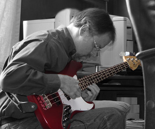
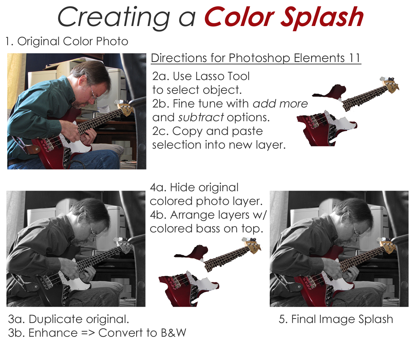
DS106 Visual Assignment 340 asked me to emphasize details- remove all color from a photo, and then restore the original color to a single object. Here’s one of my favorite examples from a project I did a few years back along with a printable 1-page directions handout.

My partner is a singer/songwriter who also plays bass and guitar. He’s been a great sport letting me experiment with new digital story telling tools over the last couple of years.  One day while in the recording studio laying down new tracks for his latest CD, he agreed to let me take photos of him in action. The original color image I use in this example is nice enough. It tells a story of a musician hard at work in the studio. But I wanted something that would really grab your attention.  I decided to highlight the bass by leaving it in living color and tone done the rest of the photo by making it black & white.  This was especially powerful when you see his black & white hands holding the colored bass. Talk about a SPLASH.

The trickiest part to accomplishing this effect using Photoshop Elements 11 is the use of the Lasso Tool.  You can pretty easily select the bulk of the object you want to leave in color- or make it a B&W object for another perspective. The hard part to making this look nice is the fine tuning you need to do while using the Lasso Tool.  I had to zoom in very close and use the add more and subtract options alternately to select only what I wanted. You then copy and paste the selection into a new layer.  As long as you don’t move any of the images in the individual layers themselves they will all align properly.

ColorSplashDemo_8X11


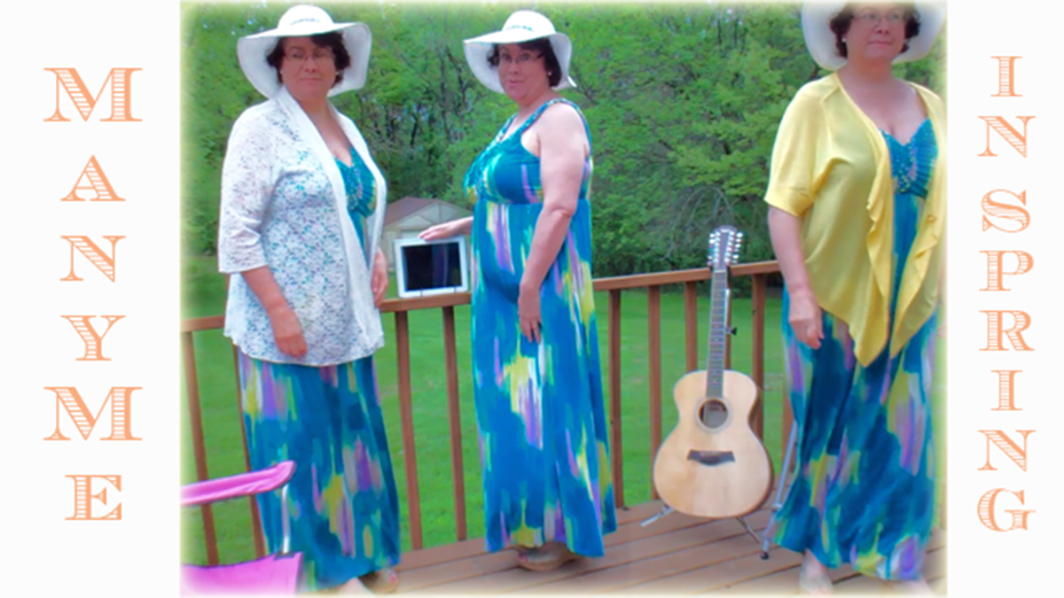
ManyMe In Spring

ManyMe Spring

I was cruising the DS106 visual assignment choices for something that looked fun and challenging – yet would only take a couple of hours to complete. The MULTIPLY YOURSELF assignment (Take two or more photos of yourself in the same location and combine them into one photo.) really jumped out at me.  And it was worth 5 stars!

The project unfolded in three phases. (Animated GIF illustrating the image evolution)

Phase I woke me up in the middle of the night, my mind wouldn’t rest as it started planning how to set-up the shots so that the photo editing phase would be easier to handle.  I initially contemplated enlisting the aid of my partner or daughter to snap the shots, but then decided to take on the challenge of doing this all by myself from start to finish.  I decided to use my FlipVideo camera on a tripod to take video footage of me in different places in the frame. Then I’d capture still images on my Mac with Adobe Premiere Elements 11 and meld the images together in Photoshop Elements 11.

Phase II was all about setting up the location, shots and shooting the video clips.  I tested a few different scenarios before I had something I thought would work.  I added interest and personality to the mix by wearing something a little different in each shot.  (As an aside, just in case I wanted to use the video later to make a “live” version of the photo, I made sure that I entered the shots from different places in the frame so that I wouldn’t cross over into another shot when I melded them together.) The weather outside cooperated by not being too windy, the overcast morning meant I didn’t have any shadows, but I still needed to work quickly as it looked like rain was on its way.

Phase III was spent putting it all together.  I downloaded the video clips into Premiere Elements 11 for the Mac and selected several still images from each of the three “Rochelles”.  I was a little dismayed that the resolution of the images wasn’t all that great.  My decision to do this assignment without a helper or the need for a timed shot delay function was now suspect. I would have had higher resolution images if I’d used my regular digital camera on the tripod instead of capturing the stills from the FilpVideo. Alas, as I’ve found so many times before, creativity abounds when I’m seemingly “stuck” and need to find another way out. Not wanting to set everything up again, I moved forward with the “sub-optimal” material I had before me. I trusted everything would work out. Besides, I’m one of the online outside participants of the course, and there’s no real grade at stake here. 😉

I diligently went to work cropping and blending my three images into one.  It was fairly easy except that the center pose lighting was slightly lighter than the two outside images.  Why??  I haven’t a clue. I shot the entire video in one 4 min session and the lighting matches at both ends.  Maybe the clouds thinned a little or something half-way through?? Who knows…. To fix this I used Enhance=>Adjust Lighting=>Brightness and Contrast on each of the 3 poses until they matched as best I could get.  While playing around I chanced upon a combination of adjustments that slightly blurred the photo even more and suddenly it looked great.  As usual I don’t exactly remember what I did to make it happen… it was “Magic”. Finally, I wanted to give the photo a border of some kind.  I like to play with all of the dials and sliders to see what shows up. EUREKA! The combination of Edit Layer Style=>Glow Inner=> Yellow was perfect.

I now have a beautiful feathered yellow glow surrounding my ManyMe photo that matches the yellow jacket I am wearing. Yippee!

Watch an animated GIF visually illustrating the evolution of the image.