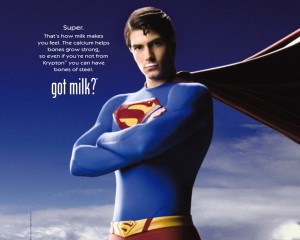
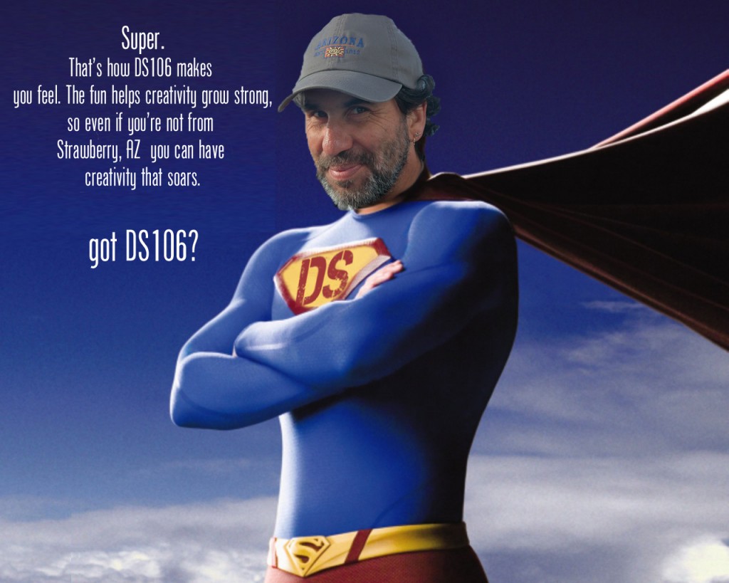
Oh boy… did I have fun with the DS106 Daily Create tdc671. We were to make a poster for a new DS106 ad campaign, ‘got ds106?’, based on the ‘got milk?’ milk industry campaign started back in 1993. [Wikipedia article]. I created the DS106 DesignAssignment1234 to share the fun with future DS106ers.
 I did a quick search of Google Images for ‘got milk?’ posters and had a plethora of great images pop up. I was immediately drawn to the Superman poster. Employing the Google once again I located the Phoenix American font used for the original campaign. The link will take you to a free downloadable non-licensed version.
I deleted the original text, then copied a section of the remaining blue sky to paste and stretch to fill the empty space. Using the newly downloaded Phoenix American font I changed a few words to customize it for our ‘got ds106?’ campaign.
Super.
That’s how milk DS106 makes you feel.
The calcium fun helps bones creativity grow strong,
so even if you’re not from Krypton Strawberry, AZ
you can have bones of steel creativity that soars.
got milk DS106?
I could’ve just replaced the text , but what would be the fun and challenge in that?

Alan Levine
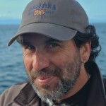
Photoshopping Alan (a ds106 instructor at Cogdog Blog) Levine’s head onto Superman’s body was a must, and turned out to be much simpler than I thought it would be. (These techniques are “simple” now, but it’s taken lots of practice and perseverance to learn them.) Choosing a good picture with the right composition was important. I wanted him to be facing to the left and tilted similarly to Superman’s. It didn’t take me but a few minutes to find a nice photo with another Google Image search, this time for Alan Levine. Amazingly, the lighting was even a close match. How lucky was that?
Using the quick selection tool in Adobe Photoshop Elements 12 for the Mac, I selected and deleted everything but Alan’s head, neck and hat. (I thought the hat added another layer of giggle-able absurdity to the mashed image.) Another bit of serendipity was that Alan’s brown jacket blended well with Superman’s cape. Yippeee! But I needed to do a little rebuilding of the top of his hat since it was cropped in the photo. This required copying a piece of it from the top, duplicating it a couple of times, reducing the size to align these little ridges on his hat, and then erasing the outside edges of each layer to produce a rounded head effect. I merged all of the layers and used the clone tool to blend them. His neck was a little trickier. I started with the Spot Healing Brush, then found two new tools today, Smudge and Blur. I was quite pleased with the results. As a finishing touch I used the blur tool again around the edges of his hat and face to give a more blended effect against the sky.
The DS chest plate was pretty simple too. I used the clone tool to erase the “S”, and produce a blank yellow background in the process. Then cut out a “DS” from the DS106 logo. By adjusting the hue and saturation of the DS layer I was able to approximate the red color of the original “S”. Resizing and transforming the layer with the skew and distortion effects was employed. And the final adjustment was to reduce the opacity just a tad.
After I uploaded the new poster to flickr I noticed that Superman’s belt also has an “S” on it. Ooops….. Oh well… it’s not about being perfect here in DS106. It’s about the creating, trying, learning, and giving it your best…. wherever you’re at.
UPDATE November 24, 2013
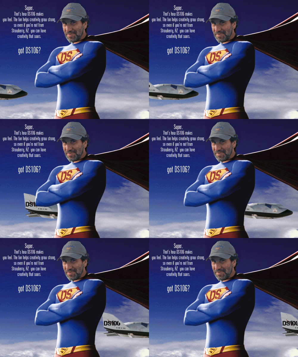
Superhero Alan Levine has been GIFfed!


[…] Got DS106 Daily Create by Rockylou […]
[…] was fortunate to already have Colin the Dog (seen at our feet), and our three heads cut out from previous projects. The biggest issue that took A LOT of time futzing around was matching the color and texture of […]
1happens