Category Archives: Assignments

It’s Going To Eat You Up!


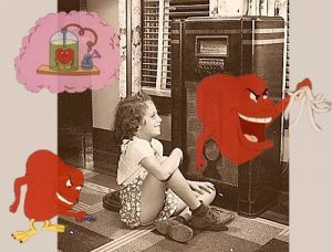
"It's going to eat you up!!"

“It’s going to eat you up!” (Click on the photo if it’s not moving.)

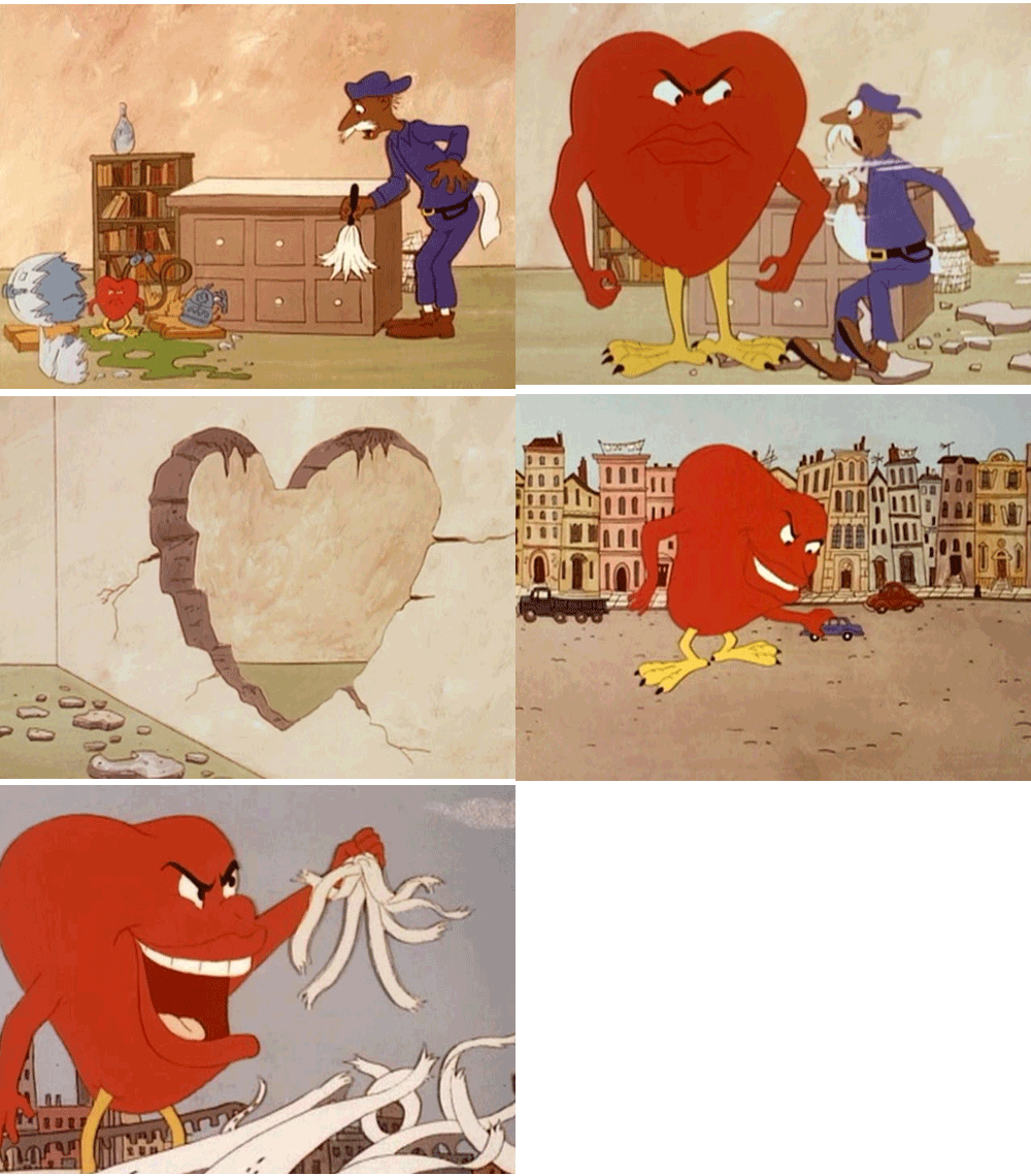
As a young child in the late 60’s, two of my favorite past times were acting out Bill Cosby’s comedy routine, “Chicken Heart”  [based on a lost 1937 “Lights Out” radio play  by Arch Oboler] with my younger sister in an old hollowed out Philco 41-280 radio cabinet

ChickenHrt_Cartoon_Radio Scenes from the Cosby Kids cartoon

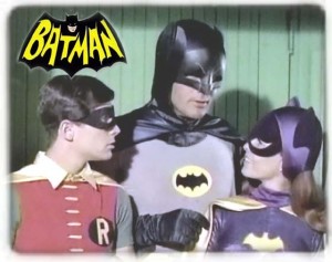
… and organizing the other kindergartners to play Batman & Robin with me…

batman tv show

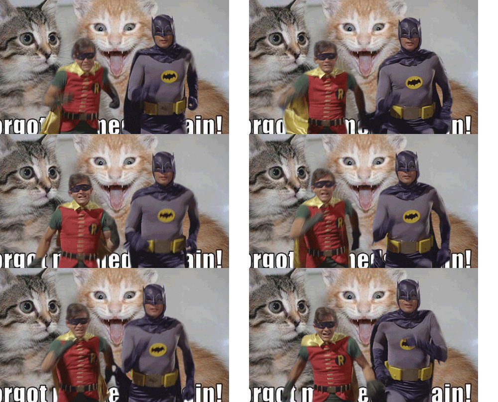
With this DS106 project I’ve combined those two fond childhood memories with my new found GIFing skills, and a little extra humor tossed in as Batman and Robin are running away from #$&%.  Check out their other adventures here and download your own PSD file to play with.

Check out the Why’s & How’s of the behind the scenes production of the GIF!

Credits & Notes:

Run! Run! I forgot my meds again!

Talk about fun! Starting with the downloadable PSD file I was easily inspired to include my “horrible” thing for Batman & Robin to escape. A manic kitten? The “I forgot my meds!” pic had me rolling on the floor with laughter the 1st time I saw it. I can finally use it.

Batman

Run! Run! I forgot my meds again!

Run! Run! I forgot my meds again!

Robin

A big thank you to Michael Smith for tweeting out his new favorite meme and creating the new DS106 AnimatedGIFAssignments1162

I have a new toy to play with.

There’s an awesome Tumblr blog created by That Design Bastard filled with animated GIFs of Batman and Robin Running away from sh*t. The cool thing is the site posts a PSD file of Batman and Robin running with a transparent background so you can make your own. He even encourages you to submit your GIF to him for consideration. Time to get those two caped crusaders running scared!

DS106zone Reflections – LouDown EP33

LouDown_RockylouHey there!  Rockylou is back home and hosting what is most likely her last DS106zone LoDown – or the LouDown as I’m calling it now 😉 – since she took over the duties from ScottLo last week. I’ve enjoyed my time in this whirlwind 5 weeks of the DS106 Summer 2013 session. I’ve met a number of creative people and seen a lot of great projects that have inspired me to take my own projects to another level. Thank you everyone for playing with me.

In the spirit of sharing and collaboration that is so prevalent in DS106, this 33rd episode of the LoDown features highlights from the audio self-reflections of two UMW students, Claire Patrick and Kelli Wisbauer, and one open-onliner from Virgina Beach, Virgina, Bill Smith.  The background music was all my doing. I hope they don’t mind the ramblin’ feel to it all. It worked for me…

So what brought them here? What have they encountered? Why are they still here? Claire admits that her first week was a complete and utter failure. But she pulled herself together and Prof. Groom even congratulated her on being the come-back kid of DS106. Kelli had to get through a lot of hurdles and maybe even shed a tear or two. Her advice? Get help as soon as you can and start the work on Monday! Channeling the spirit of ScottLo – he really can’t leave us for good – Bill Smith recorded a “drive-by” for his introduction. What keeps him in DS106? The community that’s formed, the ability to experiment, and having a forum that’s open and supportive.

Unfortunately, two UMW students posted their self-reflection assignments too late for me to include in this episode #33 of the LoDown. (I do need to get some sleep, afterall.)  I want to highlight them just the same.

I’d also hoped to include a parody by Sean Placchetti who didn’t think he could stomach all the anticipated mushy stuff about DS106.  As a matter of fact, I created the parody assignment just for him.  Sean’s Parody – Chet Shamus

It’s been a blast. I hope to create and collaborate with some of you again in the future. This is Rockylou signing off from the DS106zone LouDown. #4life

CREDITS:

DS106Zone Audio Self-Reflections

Music:

 The How And Why Of Creating EP33

construction,under-128On EP32 of the DS106zone LoDown, Alan Levine talked about how it was just as meaningful to him to know why we chose to do something as well as how we did it. Since I’m not formally trained in this area, I do a lot of my work by intuition and trial & error. This project was no different. Here’s what went through my head producing this podcast.

Reflecting on DS106

[soundcloud url=”http://api.soundcloud.com/tracks/96139137″ params=”” width=” 100%” height=”166″ iframe=”true” /]

Prompted by comments and discussions with scottlo, our DS106 audio mentor, I’ve taken the time to reflect upon and record my thoughts and impressions with the University Mary Washington open online course in digital story telling.

I find that the open, collaborative, and sometimes chaotic nature of the course allows for a tremendous amount of creativity to be unleashed, and I feel inspired by the quality of work put out there by the entire ds106 community.

There is something different going on here. We are learning from and teaching each other: Teacher to student, student to teacher, mentor to teacher, teacher to mentor, mentor to student.   Bringing our “A” game, which inspires others to do the same.  It’s not just happening in closed classrooms, but globally, across generations, synchronously and asynchronously.

[DS106ers can submit their own self-reflection here.]

 This is what the future of education can be.

DS106 Log0

UMW Open Online Course in Digital Storytelling

Note: The background music is a self-recorded version of “Can’t Find My Way Home”, written by Steve Winwood. (Often attributed to Eric Clapton.) I like the song, especially the way it sounds when I play it in on my 12-string guitar, but I don’t feel inspired by the original famous lines:

But I’m near the end and I just ain’t got the time
And I’m wasted and I can’t find my way home.

  My version, “Findin’ My Way Home”, changes the lyrics to something I can get behind and sing from my heart:

Near the end and I just ain’t got the time
To be wasted cause I’m findin’ my way home.

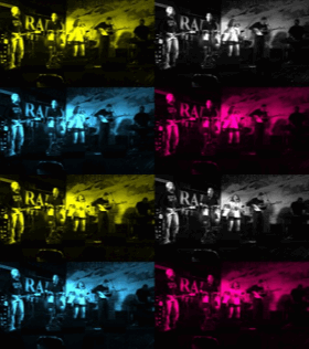
Warholing a Rock ‘n’ Roll Stereo GIF

Warhol_It_GIF

Warholing an animated stereo GIF of a rock band

Last night I was writing up my post for “Have a Rockin’ Birthday” with the usual addition of a nice tutorial to share with others since no one had posted one yet.  It slowly dawned on me how much work I actually put into completing one of my DS106 assignments.  I’m definitely puttin’ on my “A” game that ScottLo and “Prof.” Groom referred to in LoDown episode 15 today.  I want more stars!  [Imagine little Rockylou hands on hips, threatening to throw a tantrum.] I think the creative star accounting I’ve used for this particular assignment should help toward remedying the situation.  Especially since I spent practically no time creating this one.

1. I downloaded an App called GIFBoom to my iPhone (for free) that lets me take my own photos and turn them into a GIF.

2. I found two quick shots on my iPhone from a band gig I’d documented a few months back.

Rock ‘N’ Roll ‘N GIF AnimatedGIFAssignments851 (3 stars)

3. They worked great to show the stereo GIF effect.

Stereo GIF AnimatedGIFAssignments991 (1 star)

4. The App gave me several options to add an additional effect.  I chose the Warhol filter.

Warhol Something VisualAssignments560 (2 stars)

5. Ta Da! Assignment complete.  Blog post written.

Animated GIF

Animated, Rock ‘n’ Roll GIF Completed!

By my count that’s 6 stars!  What say you Prof. Groom?

Have a Rockin’ Birthday

I wanted to give my my son-in-law a special birthday card this week.  AnimatedGIFAssignments1086 was just the thing.

Make someone a special birthday card, but make it extra special by including a GIF!!  Try to make the design unique to them (it’s THEIR birthday, after all!).

Animated Birthday Card

‘Shakin’ It Up’ for a special birthday card

I’m starting to get good at this now with all the practicing I’m doing with my new GIFing skills.  I use Photoshop Elements 11 for the Mac as my image editing tool, and here’s my tutorial on the making of this GIF.

Original Birthday Card Image

Original Card

Step 1: For this project I started with an image I found on-line from a free create-your-own birthday card site.  I chose this image because it had a solid white background which makes it much easier when you get to the point of merging the layers.  And that was important because on this card I wanted to make the guy dance, but keep the text still.  I also wanted to add a little something extra to personalize it.
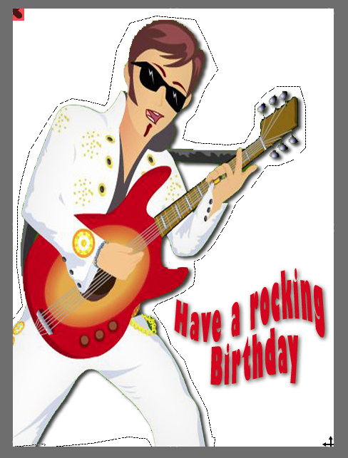
Lasso Tool Selection

Selecting Image with the Lasso Tool


Step 2: Use the lasso tool to capture only the guitar player as illustrated above.  Copy and paste it into a new layer with a transparent background.  Then grab the image of the “Have a rocking Birthday” text and do the same thing.  Then you’ll end up with two pieces of the image on two different layers, with transparent backgrounds.

Making Music on the Computer

Step 3: To personalize the card create another layer with your text or a special image.  I used this free clipart icon of a man sitting at a computer making music as my son-in-law, Michael, has just taken up a new hobby learning how to create music on the computer.  I think he might be using Audacity even.

Guitar Player Images

Step 4: Create Guitar Player Image Layers

Step 4: Duplicate the guitar player to create three identical layers.  Rotate two of the images +5deg and -5deg.  You now have 3 guitar players, one leaning forward, one leaning back and one in the middle.

Step 5: For the border I made a rectangle with a transparent fill in PowerPoint (I know my way around the program very well, and it was just easier to do it there.) and saved it as a picture in the .PNG format.  This allows you to maintain the transparency of the images.  We’ll also need a solid white layer. You should end up with 7 unique layers at this point. But we’ll need to make duplicates of layers 4-7 below to be used during the layer merging process.

1. Guitar Player tilted backward (1)

2. Guitar Player in the center (1)

3. Guitar Player leaning forward (1)

4. “Have a Rockin’ Birthday” text (x3)

5. The computer guy icon (x3)

6. The border with a transparent middle (x3)

7. A solid white layer (x3)

Step 6:If you haven’t already, duplicate layers 4-7 so that you have 3 of each as noted above.

Step 7: Now it’s time to start merging the layers together so that you end up with only the guitar player moving and everything else remaining still.  These new merged layers are what will be used to create the actually GIF. Make sure you save your work often and I’d highly recommend saving the work you’ve done creating the individual image layers as its own file at this point – just in case you make an error during the merge process, you have something to go back to.  You really don’t want to start all over again do you?

Note: The white layer should go at the bottom of your stack.  It is supposed to be the background.  Otherwise when you merge the layers you’ll end up with only a white image.

Rockin B-day Final Image

Final merged image

Merged Layer 1: Guitar player tilted back =  1 + 4 + 5 + 6 + 7

Merged Layer 2: Guitar player in center =  2 + 4 + 5 + 6 + 7

Merged Layer 3: Guitar player leaning forward =  3 + 4 + 5 + 6 + 7

Duplicate merged layer 2 (the guitar player in the center) so he’ll rock forward and backward evenly. Ta Da!  You now have the four layers you’ll need to create your GIF.  Center => Forward => Center => Backward. If you’ve done it right you’ll only see the guitar player rockin’.

Step 8: In PhotoShop Elements 11 you select “Save For Web” to preview your GIF. On the right hand side menu, select GIF, Transparency, Animate, and set your speed in the “Frame Delay” box at the bottom. The default delay of 0.2 seconds works for most projects. Click on preview over at the bottom left and you can watch your masterpiece in action.
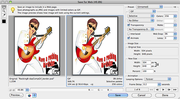
SaveForWebWindow_8in

Step 9:  If you like what you’ve done, save it as a GIF.  To view the file once it’s on your computer you’ll need to open it with your browser.  On my Mac I right click the file, select ‘Open With’ Google Chrome.

Bumping The LoDown

What better way to show my appreciation than create a series of radio show bumpers for my teacher.

Scott Lo hosting the LoDown for DS106 this summer

+

AudioAssignments36 to create a DS106 Radio Bumper

+

HAPPY STUDENT improving her audio storytelling skills

=

5 different LoDown bumpers for Scott to use freely on his radio show and blog posts

What is a bumper? It is a short recording that identifies the radio station with signature music or an expression that makes sure the listeners know what they are tuned into.

Lo DownThere’s no mistaking that you know where you are and where you’re tuned into with this set of bumpers.  I used as my foundation a single voice track that I recorded while in the grocery store parking lot with a new iPhone app, Recordium, that I downloaded yesterday at the recommendation of Scott on LoDown episode 12.  Then the real fun began …….

I’ve been experimenting lately with how a soundtrack can drastically change the mood of the media project I’m working with. A few months back I was creating a photo slideshow for a friend, and it was amazing how the flow of images, and our decision to add title text or not, was altered by the choice of music.  I’m able to illustrate that effect at some level with this set of bumpers.  The spoken audio remains the same, just new music underneath.

I had plans to really show this effect by adding a soundtrack that was silly or comedic. But sadly, couldn’t find an audio file in my stock list of jingles and stingers in GarageBand that fit the bill.  I’m still giggling though at finding the Medal Ceremony (LoDown3) and Broadcast News (LoDown 5) clips.  I hope Scott will be just as amused and want to use them for DS106 Audio Week. 😉 I’d highly recommend anyone who hasn’t worked with soundtracks to try something like this.  You gain a whole new understanding and appreciation for the emotional power of sound.

One last note: I’m sure most of us have run up against the powers that be and have had issues with YouTube or Facebook taking down our videos (or highjacking them by adding product advertisements – grrrrr)  because of Copyright Infringement.  My way of addressing this from the beginning is to use the Vimeo Music Store to locate tracks I can use legally without question. You can even create custom tracks that perfectly fit your videos.  It’s a great resource and there is a lot there. There are free creative commons, $1.99 personal use licenses, and $20+ commercial use licenses available.   I’ll test a tracks suitability and mood by having two windows open on my computer, one playing the slideshow the other playing the music file on Vimeo.  Then when I find something I like, I pay the $1.99 just like on iTunes, and download it. Check it out.

[Other Radio Bumper projects I’ve completed: Obruni Podcasts, Mashing for DS106 Radio)]


Mashing a DS106 Radio Bumper

Thanks to my fellow DS106 students who made sure they clicked on the “Allow Downloads” button in SoundCloud, I was able to mash this DS106 Radio bumper.  It’s short and sweet, just like this post. AudioAssignments36

Big kudos to my unsuspecting contributors….

Dylan Gott – Brooke Parker –  Kristen Lamb – Jennifer  – Rapt’nRent

ds106.ioAnimatedNewOldFriend_290

Podcast Bumpers for Obruni Series

For an earlier audio assignment to create a 90sec story out of at least 5 sound effects, I used sound effects that I already had on hand from a series of podcasts I am producing with my daughter, Amber. As before, I’m again making a slight tweak on the formal assignment description for DS106 Audio Assignment 36, “Create A Ds106 Radio Bumper”.

What is a bumper? It is a short recording that identifies the radio station with signature music or an expression that makes sure the listeners know what they are tuned into.

It’s still a bumper, but for a podcast, not DS106 Radio. There are three different audio files posted in the series.

Track 1: “Intro Music RLProductions” is used like an abbreviation or I what I like referring to as an Audio Icon for anything associated with Rockylou Productions. I’ll digress just a minute hear to say that I know I’m mentioning Rockylou Productions  often in my posts. I’m not trying to promote myself, this just happens to be my personal playground of creativity where I spend much of my free time, and I have material I can easily pull from to complete the assignments in a more compressed time frame.  I then have time to create tutorials for the assignments that can help others.

Back to your regularly scheduled program…….

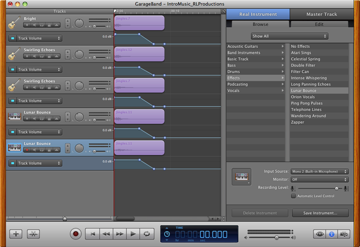
The Audio Icon is used at the beginning as part of the intro and at the very end.  We also use this chord as part of the final credit sequence for some of our videos. It was made by recording myself playing a simple “D” chord on my 12 string guitar.  Then I used GarageBand to layer 5 different tracks by playing around with different effects. It was a fun morning putting that together.  I just kept trying this or that, until I stumbled across a combination that I felt was memorable.

GarageBand screen shot of the layered tracks for  the Rockylou Productions "Audio Logo".

GarageBand screen shot of the layered tracks for the Rockylou Productions “Audio Logo”.

Track 2: “Obruni Bumper Start” is an example of the template and style we use for our intro.  The chord plays to let you know that you’ve arrived.  Then I welcome the listener and give a short introduction of the podcast they are about to hear.  We want this to be short, but descriptive enough to grab the listener’s attention and they’ll want to keep on listening.

Track 3: “Obruni Bumper End” is an example from another podcast in the series, “Transportation”. But the format is always the same.  At the end of the spoken text of the story I increase the volume of the soundtrack that we have associated with the Obruni podcasts.(See note.) I then fade in the the audio credits – like who it was written by, an attribution for the soundtrack music, and anything else that may be needed. At the very end you hear the familiar Rockylou Productions chord strum that lets the listener know we have now “left the building”.

Note: I had to track down the publishers to obtain written permission to use the Fanti music, Apatampe, so that I wouldn’t infringe on copyright issues.  It took some digging, but I finally found the publishers and they were very nice about it.  As long as I included an attribution and I didn’t use it for commercial purposes, it was fine to use for my projects.

Up, Up, And Away


Animated Movie Poster GIF

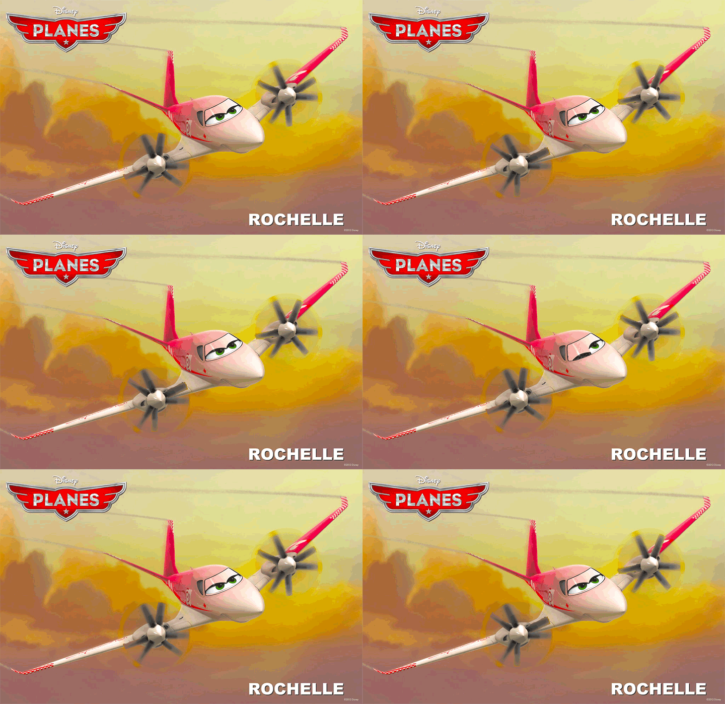
Meet Rochelle from Pixar’s movie “Planes”.

Still enamored with creating GIFs, I stayed up way too late last night creating this animated movie poster from the movie Planes by Pixar to be released in theaters August, 2013. (DesignAssignments313)

Let me give you a little background on why I chose this particular movie poster. My name is Rochelle, and it’s not a very common name in the United States.  I met only one other Rochelle growing up, and that was in High School.  I’ve met maybe 5 others my whole life. So when a Facebook friend posted on my timeline that Pixar would be introducing a new character in their upcoming movie about planes, I was beaming,

 “I have a cartoon character named after me?”  

Now this assignment would give me the opportunity to create something out of a real movie poster that had my name on it.  How cool is that? If I liked it, I could see using it in other circumstances around the web. I do like my final product, so you might see it popping up again.

Keeping with this week’s design theme, I studied the poster to understand what is being conveyed in the image.  Since the movie isn’t even out yet, I read the Pixar synopsis of the movie and more specifically the plane character, Rochelle. (voice of by Julia Louis-Dreyfus)

Excerpt from Pixar site:

Rochelle

Pla rochelle rolloutimage v3-0simp

(voice of Julia Louis-Dreyfus)

Rochelle is a tough racer and the pride of the Great White North. Always confident and capable, she got her start running mail to small towns in Quebec, picking up home remedies for mechanical maladies along the way. She also developed a knack for fast travel that ultimately inspired her to give air racing a try. Rochelle never looked back (this competitive contender doesn’t need to). She is relentlessly pursued by charmer El Chupacabra, but steadfast Rochelle is much too focused on winning the race to return his affections.[20]

I would also need to keep in mind the file size limitations of a GIF, how many frames I’d be allowed in my photo editing software, and since I didn’t want this project to consume my life for days, the number of frames I’d actually have to create.  I decided that the important elements of the poster to focus on would be that this is a plane, and then illustrate something about Rochelle’s personality.  My first overly ambitious thoughts were to have her fly on the poster.  Moderating my initial exuberance with a dose of reality, I admitted to myself the work required to make the plane actually fly in or out of the poster was way too complicated to pull off.  My rational, although still very creative self, went with animating the propeller props, and giving her a wink.  I’m not totally at peace with the symbolism of her winking, since the character synopsis says she is steadfast and much to focused on winning the race to return another plane’s affection, but I’ve seen the blinking effect used in a lot of other GIF projects (Ben’s “The Colorized Zone” was a big inspiration), so why not give it a try.

[An illustrated detailed process of creating this animation will be documented and posted as a tutorial eventually. Until then, you can view a tutorial example with only one animation zone.] 

A summary of the process using PhotoShop Elements 11 for the Mac:

1. I used the lasso tool to grab an image of each of the propellers and the eyes/windshield of the plane. This was pretty painstaking while I experimented with which parts of the propeller would work best to create the rotating effect.  I then duplicated the propeller images and rotated them 30deg and 60 deg. I ended up with 3 different propeller images for each side of the plane.

2. For the winking eye I used the lasso tool again to capture just the left half the windshield image.  Then started stretching, erasing, copying, pasting, aligning… until I had something that looked right.

3. Once all of the individual image layers were created, it was time to merge the appropriate layers to create new combined images that would animate correctly.  Oh my was this a chore as it became closer and closer to midnight.  I was creating a total of 3 animation zones?! My brain just wasn’t working as well anymore and I was having a hard time following tracking of what went where.  And remember that ambitious enthusiasm I spoke about? Well I added in an additional challenge to have each of the propellers appear to be spinning a little differently. And believe you me, it was no walk in the park to properly align everything so that those parts that were supposed to be still remained still.  I didn’t want any distracting jumping around of the animation.

4. The timing of the animation sequence was also important.  I didn’t want her constantly winking, yet I wanted the propellers to be moving at a quick rate to provide a better spinning illusion. I was able to create the effect I wanted by duplicating more of the image layers for the propellers and sandwich the winking effect in the middle. All-in-all I ended up with a total of 14 frames: 8 propeller frames + 2 winking frames + 4 propeller frames, all running at 0.2 seconds per frame.

As I mentioned above, this post only gives a high level synopsis of creating this GIF.  The tutorial will have much more detail with screen shot images and examples at each stage as I move through the creation process.