For my week 2 DS106 Headless 13 summary I created a separate summary post for all of my daily creates from that week. It’s not only highly recommended, but I find it helpful to my own learning to write-up my process while producing my projects and share those learnings with others. The bulk of the daily create projects were very straight forward or I was recycling a previous project that already had a process post. But one of them, (actually two combined into one.) really should’ve had a full write-up completed and here it is.
I was quite pleased with my brilliant use of the reuse principle by combining two daily creates into one photoshoot. tdc601 asked us to draw something DS106ish backwards in recognition of 601 being the reverse of 106. Here I’ve drawn DS106 backward again on my iPad with the Paper53 app.
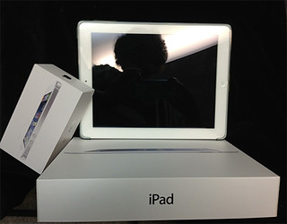
In combination with my submission for tdc602 capturing the elegance of Apple products that are designed with elegance in mind from the device to the packaging right down to the details of the insert materials. It is an experience just to open the box for an iPad or an iPhone.
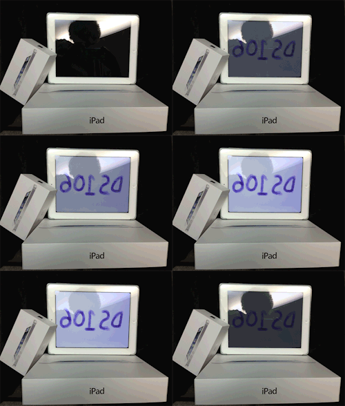
A very simple GIF was also added to the mix.
DS106 Elegance for tdc601
Shared from rockylou22 using Embeddlr
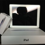 The photos were taken with my iPhone and the Camera+ app. I used two photos. One with the iPad turned off while positioning myself so that the overhead lighting would cast my reflection in the screen.
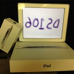
The second photo was taken with the iPad on and the image of the backwards DS106 I’d drawn in the Paper53 app visible. There was a problem though. I didn’t know how to set and lock the white balance, so the second image with the DS106 had a very yellow tone that did not look elegant at all.
To make the GIF work I used the magnetic select tool in Photoshop CS5 to select, copy and paste into new layers, and then remove the screen from both images leaving me with a blank transparent screen. The screens were placed into new layers and I used only the nicely white balanced photo as the base for the GIF.
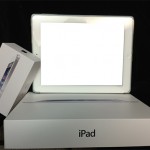 But another issue now cropped up. Look closely at the iPhone box on the left-hand side of the two original photos. It overlaps the screen a little. In the blank screen image it has been cut off. To remedy this visual anomaly I used the select tool to select the overlapping corner of the box then copy and paste it into a new layer. That corner layer was placed atop everything else.
Next I created screen layers of the with varied opacity in 10% increments. The animation duration for each frame was set to 0.2 seconds except for the full on and full off images which were increased to 1 second to allow the viewer to experience those images more completely. The GIF was reduced to 500px width to keep the file size down but I kept it at 256 colors to preserve the elegant look of the images.
One final note…. My WordPress theme wouldn’t embed a Tumblr post by just inserting the URL. A search on the internet found a site, Embeddlr, that will generate the embed code that I used above. Handy little tidbit to have on hand.

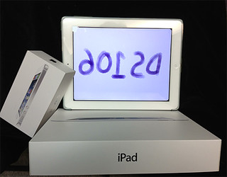
[…] UPDATE: (9/10/13) The above daily create duo now has a project process posted. There were a few little tricks to getting the images and GIF to look nice. [Link] […]