[soundcloud url=”http://api.soundcloud.com/tracks/94573148″ params=”” width=” 100%” height=”166″ iframe=”true” /]
Amber arrives in Ghana, Africa. The new “Obruni”, or white person, both delights and scares the young children of Takoradi, and she soon discovers the way music can transcend cultural divides. Listen to the original full length podcast episode the sound effects were taken from at http://rockylouproductions.com/2010/10/18/obruni-take-it-up/
Audio editing is not for the faint of heart. Especially if you can be a perfectionist or have a tendency towards OCD. [Guilty as charged…] You can fiddle around and fine-tune forever. (Note: The audio clip attached happens to be an updated version from what I posted earlier this morning. I didn’t like that the car racing by in the beginning was inaudible on my iPhone. So I fixed it!) But it can really be worth it when you come back months later to a piece you created and go, “Wow, I did that?”
Inspired by LoDown episode 8, I jumped in to create my own sound effect story – Audio Assignment 70 with a slight variation of having a bit of spoken and sung text. The assignment asks us to create a 90sec or less story with at least 5 sound effects. I decided to use sound effects I had from a podcast I had created with my daughter, Amber, in the fall of 2010. We really didn’t know what we were doing back then at moving her stories off the written page and making them audible. I didn’t have any experience with sound editing software, and I didn’t even know what a Podcast was. Amber had to suggest listening to StoryCorps and WYNC’s RadioLab to help me become familiar with the genre we were embarking upon.
I’m a big Apple fan and went with GarageBand as my sound editing tool. I wasn’t up to the VERY steep learning curve for the more professional stuff. (And I hadn’t heard about Audacity. I’ll have to check it out at some point during the course.) I have plans for a future blog post (possibly a series or a LoDown co-hosting gig) that will go through the creation process for the entire podcast episode, but for this post I’m going to stick to the sound effect story.
A story needs to have a beginning, middle and end- now doing that in 90 seconds can be a challenge. Finding the right sounds, keeping in mind copyright issues, [link to my YouTube playlist on copyright and creative commons] is also a big challenge. We used freesound.org, pulled sounds off of creative commons YouTube videos, and even created some of our own sound effects if we couldn’t find what we wanted. But again… that’s a story for another blog post. My storyline for my sound effect story could be an audio trailer for the larger podcast. The over arching story is about how the people of Takaradi, Ghana reacted to this new white person in their midst and how she responded.
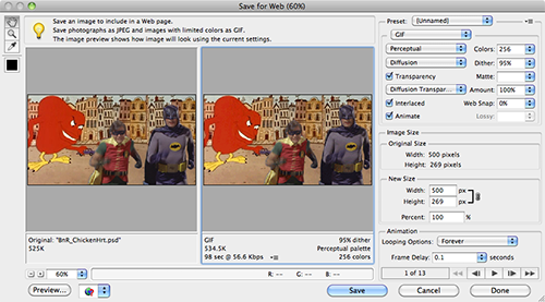
Let me take you through at least a portion of my process. Below is a screen shot of the final GarageBand file. I like to build my layers (technically called tracks) from the bottom up when possible. That way I know where I’m at, and it makes sense to me as I layer on my sounds. So that’s how I’ll be referring to them as I move along.

GarageBand Screen Shot of sound effect tracks only
Setting the Scene (track 1 & 2) To set the scene we used a lively chaotic market place sound effect that is actually a combination of two different sound effects grabbed from freesound.org. (Called Market Place 1 and Market Place 2 above.) Neither of them sounded right alone, but the combination was just what we wanted. Experimenting with different combinations is a great way to find just the right sound you are looking for.
The first “event” in the story was the addition of a car racing by on track 3. Remember I’m counting from the bottom up. If you listen with headphones or good speakers you’ll be able to hear the stereo effect as the car goes whooshing by. There are things happening in and around the market place.
Our story gets more personal when track 5 brings in the children laughing, while track 3 changes over to shouting out “Obruni”. Both of these effects were pulled from YouTube videos. So… why you might ask don’t I put each sound effect on its own separate track? (Track 3 has 3 different effects.) Because it’s a visual nightmare when you have to keep scrolling the screen to see where you are at. I try to limit the number of tracks I need to what can fit on my computer screen. For our big podcasts that almost never happens -but we try. And labeling your larger tracks with something you understand, as well as the individual clips, is a good practice. All things we learned the hard way!
With track 4 we hear a child crying and Amber fading in, softly humming “Amazing Grace”, to soothe the little one on track 6. Track 6 continues and morphs into Amber actually singing. With track 7 the choir joins in. Amazingly we found this little, slightly off key (just what we wanted) choir with a YouTube search. A set of congo drums joins the party on track 8. Then it’s back down to track 3 with the audience applause. Our final track 9 brings the story toward a close with Amber singing alone again.
I very purposely chose segments of the sung lyrics to coincide with an event in the story or a feeling I wanted to impart. The child is crying, Amber hums then sings, “that saved a wretch like me.” Amber is then saved by the choir joining in. I could have used the humming again at the end, but concluding on “Amazing Grace, how sweet the sound…” was just too much to pass up. Like a good poem, there are many layers of meaning that can be interpreted by a listener.
At the very end the market place sounds coming back into auditory focus to take front and center stage. Life continues on with one final master fade out.
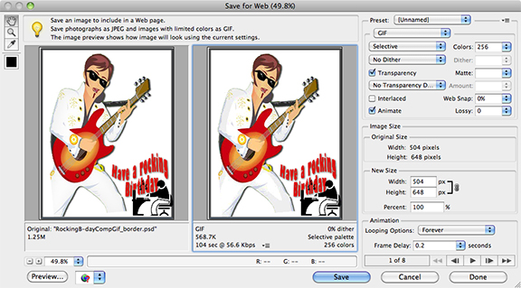
Fine Tuning: But least you think we are finished… Oh No… you would be wrong. You can consider this version of the audio file a rough draft. But at least these aren’t just end-to-end clips. I’ve talked about some layering here. How these sounds are in relationship to one another is a big deal. Blending one sound effect into another and adjusting the volume balance between clips can add a lot to your story. Panning the sound effect into one ear or the other or the stereo effect like the car racing by are nice details to add. You have to be careful with this though. You don’t want to end up making your listener dizzy because what they are listening to doesn’t make sense. With the screen shot below I’ve opened up the track volume areas so you can actually see what I’m talking about.

GarageBand file with volume track shown
Track 1 & 2 market sounds fade in at the very start. We don’t want to alarm our listeners with an abrupt beginning. The idea is to create and maintain a listening experience that someone wants to join and hang-out in. If it feels “chunky” (as Amber & I refer to it) anywhere in your audio file your listeners will pick it up. Maybe not consciously, but they’ll know something isn’t quite right. Choke back the false pride and fix it! You’ll be glad you did.
I made sure the track 3 car sound effect faded out nicely so you knew the car was fading into the distance. And the clip we used for the kids laughing on track 5 had an erratic volume level. It was too soft at the beginning, so I bumped it up and brought it back down toward the end of the clip.
When the child is upset and crying (track 4) at seeing this person with a different color of skin than her own, she cries full on. Then her effect begins to trail off as Amber’s humming effect on track 6 crosses over. At this same time I reduce the background market audio (tracks 1 & 2) so that the listener is able to focus on the next event in the story. But since my story takes place in a market place, I don’t want to mute it completely.
As Amber is singing (track 6) the people in the market place gradually join in (track 7) and then someone fades in with a beat on drums (track 8). I get a sense of a subliminal cadence that I follow to get the timing just right. (When that “chunky” feeling pops up that I mentioned above, I’m most likely out of step with the piece and keep tweaking till it feels right.) We then linger here just a bit on this climactic moment of the story before the the audience claps. (Back down to track 3.)
The clapping trails off, and Amber returns alone,(track 9) but this time with a more ethereal sounding tone. That’s why this clip was placed onto track 9 instead of remaining on track 6 with the other Amber clips. I wanted to modify the basic sound effect to give the feeling of a dream or fade away into the distance.
There is more mixing and “Mastering” of the final audio that happens next to give your audio file more life, but I’ll save that for another post. As well as going into how to export your file so that you aren’t shocked at the low sound quality that you disappointingly ended up posting. Scott Lo and I are contemplating a LoDown episode for audio week 3 entitled, “How come what I posted doesn’t sound like what I made?” Any interest in that topic? In short it has to do with the audio file compression you need to do so people can download and listen to them on your mobile device. This 90 sec story uncompressed (AIF) is 23 MB, while the compressed MP3 that you listened to above is only 2.9 MB. And it could be even lower if I used the standard bit rate compression of 192 KB rather than 256KB which I prefer.

Typical “High” quality compression rate settings for GarageBand.
Okay… That’s going to wrap up this post. It’s time for bed. Let me know if you have any questions or would like me to explain in more detail how I did something. Hopefully I’ll have the time to write up more posts on the subject.
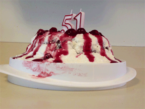
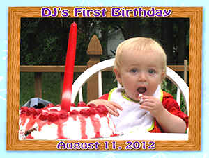 Once again I’m employing my DS106 time saver maxim to Reduce – Reuse – Recycle by creating a video that takes a close look at the food we eat (for DS106 daily create TDC 633) with photos and footage I had already taken. This time it’s with my favorite birthday cake which has made several appearances in daily creates and other digital storytelling projects.
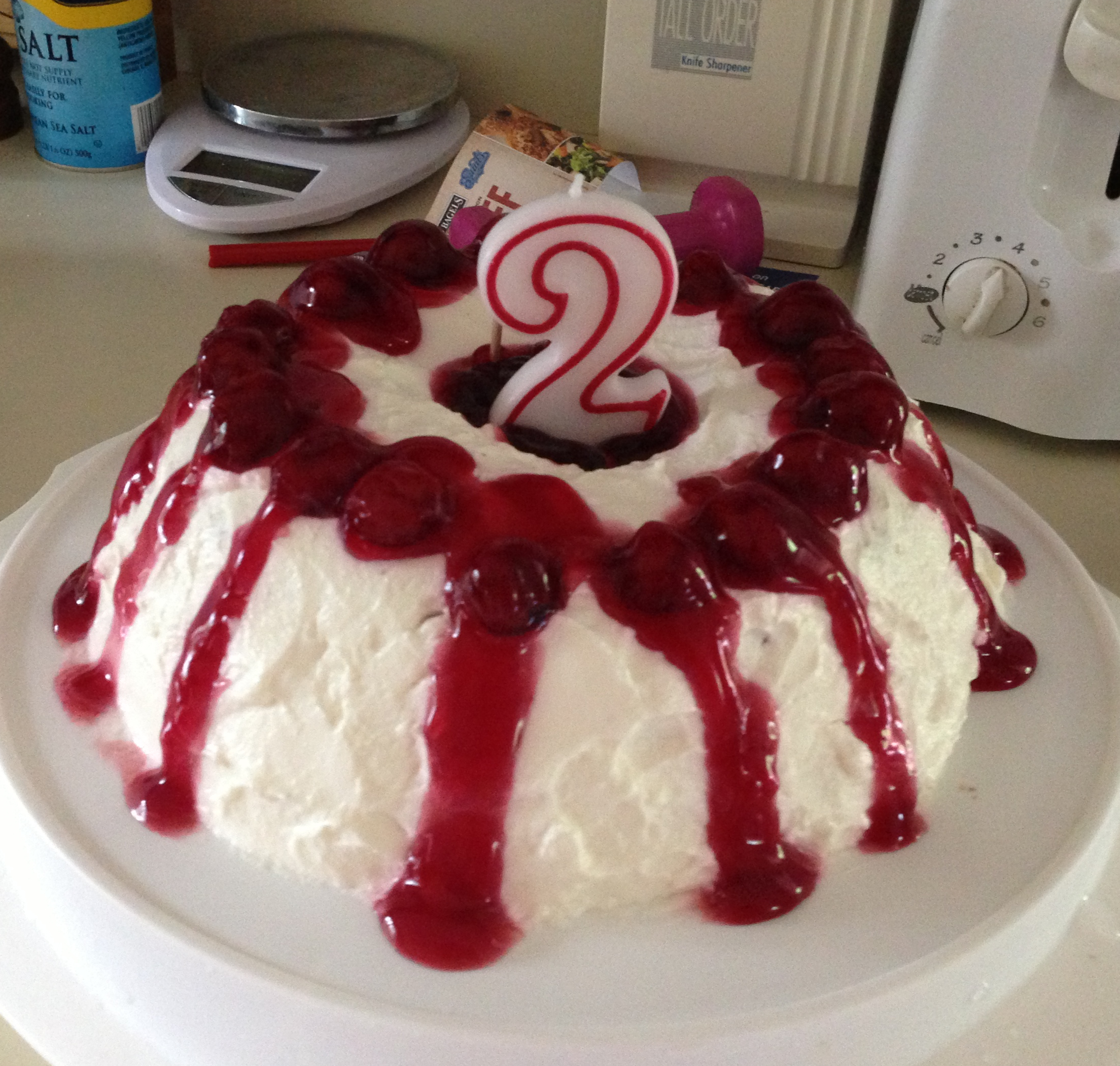


